ステルスレトロベゼルの壁紙
Stealth Retro Bezel
iOS 16–
iPhone Air/17 Pro Max/17 Pro/17/17e/
16 Pro Max/16 Pro/16 Plus/16/16e/
15 Pro Max/15 Pro/15 Plus/15/
14 Pro Max/14 Pro/14 Plus/14/
13 Pro Max/13 Pro/13/13 mini/
12 Pro Max/12 Pro/12/12 mini/
11 Pro Max/11 Pro/11/XS Max/XS/XR/X
・▲・ iPhone=?iOS=? ・▼・
iPhone Air/17 Pro Max/17 Pro/17/17e/
16 Pro Max/16 Pro/16 Plus/16/16e/
15 Pro Max/15 Pro/15 Plus/15/
14 Pro Max/14 Pro/14 Plus/14/
13 Pro Max/13 Pro/13/13 mini/
12 Pro Max/12 Pro/12/12 mini/
11 Pro Max/11 Pro/11/XS Max/XS/XR/X
・▲・ iPhone=?iOS=? ・▼・
ベゼルをホームボタンiPhone風に。
文字を暗くして目立たなくします。
Bezel styled like a Home Button iPhone.
Darkens text to make it less prominent.
文字を暗くして目立たなくします。
Bezel styled like a Home Button iPhone.
Darkens text to make it less prominent.

1320×3002
Universal Wallpaper
Universal Wallpaper
How to Set
・▲・
・▲・



そっと少し、つまんで上げて、放す
自然光/白黒
ホーム画面:ぼかしオフ・明暗お好み
───────────────
Gently pinch up a little, then release
Natural/Black & White
Home: Blur off; light/dark to taste
───────────────
⚙︎ Help ⚙︎
自然光/白黒
ホーム画面:ぼかしオフ・明暗お好み
───────────────
Gently pinch up a little, then release
Natural/Black & White
Home: Blur off; light/dark to taste
───────────────
⚙︎ Help ⚙︎
・▼・
タップ → 表示 → 長押し保存
Tap → View → Hold to save
タップ → 表示 → 長押し保存
Tap → View → Hold to save


★
- そっと少しピンチイン ▶︎ 少し上に上げて ▶︎ 指を放すと、自動的に左右いっぱい下ゾロエの位置に戻ってきます。とくにiOS 27以降のApple Intelligence対応機種ではピンチインし過ぎると「拡張」がはたらくので、その手前で止めてください。「拡張」に入ってしまったらキャンセルしてやり直す必要があります。
- iOS 16以降のiPhoneでは壁紙を設定する時の表示位置がまちまちです。さらにiOS 17–26では壁紙を動かすと自動補完で上部がぼかされることがあります。これらをかいくぐって全画面表示にするため、超縦長壁紙を上にスワイプして設定する仕様にしました(iOSのバージョン、機種、絵柄の相性によってはぼかしを避けられないこともあるかもしれませんが、iOS 27で自動補完は廃止されました)。壁紙上部はカットされ、表示位置はすべての機種で下ゾロエになります。
- 画像形式をWebPにして高品質軽量化を図っています。iOS 14以降で表示できます。
- Gently pinch in a little ▶︎ lift up a little ▶︎ release your fingers, and it’ll automatically snap back to the bottom-aligned, full-width position. On iOS 27+ Apple Intelligence–compatible devices especially, pinching in too far triggers “Extend,” so stop just short of that point. If you do trigger “Extend,” you’ll need to cancel and start over.
- On iPhone running iOS 16 or later, the wallpaper’s display position varies when you set it. In addition, on iOS 17–26, moving the wallpaper can trigger Auto-Extend, which blurs the top area. To work around this and achieve a full-screen display, this wallpaper is designed as an extra-tall image that you swipe upward to set (depending on the iOS version, device model, and image composition, the blur may not always be avoidable — though Auto-Extend is removed in iOS 27). The top of the wallpaper will be cropped, and the display position will be bottom-aligned on all devices.
- The image format is WebP to make it high quality and lightweight. iOS 14 or later can display it.
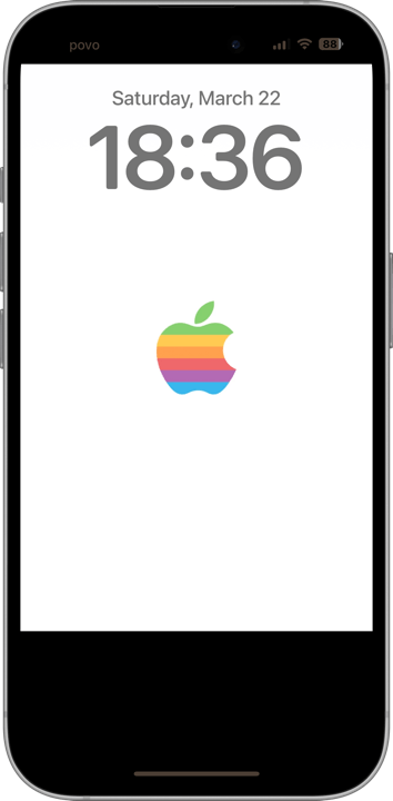
上下を黒くしてホームボタンモデルのようなデザインにする壁紙です。5.4インチから6.9インチまでのすべてのiPhoneにマッチするようにレイアウトしています。りんごマークはウィキペディアのAppleページからパブリックドメインの画像を使用しました。カラーはM4 iMacをモチーフにしています。
ステータスや検索ボタンのテキストを暗くするために背景を白地にしました。ホーム画面のカスタマイズで壁紙を暗くしても大丈夫です。文字の色はりんごの色の影響を受けます。
そのままでは黒いベゼルとの輝度差が最大になって有機ELの焼き付きの原因になるかもしれないので、AppleがiOS 10で使用していた技術を参考にした予防策を講じています。iOS 10では壁紙の表示位置が縦横0.5ピクセルずつずらされていました。もちろん描画の最小単位は1ピクセル。色の境界にあたる1ピクセルは2色が混ざったものになり、拡大するとぼやけることになります。コントラストが低くなるわけです。この壁紙ではベクターデータ上で上下の黒をを0.5ピクセルずつずらしました。
Wallpapers with wide black areas to mimic Home button models. Carefully designed to fit iPhones from 5.4” to 6.9”. The apple symbol is a public domain image from the Apple page on Wikipedia. The colors are inspired by the M4 iMac.
o darken the status and search button text, I set the background to white. It’s fine to darken the wallpaper when customizing your Home screen. The text color is influenced by the apple’s hue.
If left as is, the maximum brightness contrast with the black bezel could potentially cause OLED burn-in. To prevent this, I’ve adopted a technique inspired by what Apple used in iOS 10. In that OS, the wallpaper’s display position was shifted by 0.5 pixels both vertically and horizontally. Since the smallest drawable unit is 1 pixel, the 1-pixel boundary between colors becomes a blend of the two, softening the edge when enlarged and reducing contrast. In this wallpaper, the black areas at the top and bottom have been shifted by 0.5 pixels in the vector data.
ステータスや検索ボタンのテキストを暗くするために背景を白地にしました。ホーム画面のカスタマイズで壁紙を暗くしても大丈夫です。文字の色はりんごの色の影響を受けます。
そのままでは黒いベゼルとの輝度差が最大になって有機ELの焼き付きの原因になるかもしれないので、AppleがiOS 10で使用していた技術を参考にした予防策を講じています。iOS 10では壁紙の表示位置が縦横0.5ピクセルずつずらされていました。もちろん描画の最小単位は1ピクセル。色の境界にあたる1ピクセルは2色が混ざったものになり、拡大するとぼやけることになります。コントラストが低くなるわけです。この壁紙ではベクターデータ上で上下の黒をを0.5ピクセルずつずらしました。
Wallpapers with wide black areas to mimic Home button models. Carefully designed to fit iPhones from 5.4” to 6.9”. The apple symbol is a public domain image from the Apple page on Wikipedia. The colors are inspired by the M4 iMac.
o darken the status and search button text, I set the background to white. It’s fine to darken the wallpaper when customizing your Home screen. The text color is influenced by the apple’s hue.
If left as is, the maximum brightness contrast with the black bezel could potentially cause OLED burn-in. To prevent this, I’ve adopted a technique inspired by what Apple used in iOS 10. In that OS, the wallpaper’s display position was shifted by 0.5 pixels both vertically and horizontally. Since the smallest drawable unit is 1 pixel, the 1-pixel boundary between colors becomes a blend of the two, softening the edge when enlarged and reducing contrast. In this wallpaper, the black areas at the top and bottom have been shifted by 0.5 pixels in the vector data.