ラージライトの壁紙
Large Light
iOS 14–
16 Pro Max/16 Pro/16 Plus/16/16e/
15 Pro Max/15 Pro/15 Plus/15/
14 Pro Max/14 Pro/14 Plus/14/
13 Pro Max/13 Pro/13/13 mini/
12 Pro Max/12 Pro/12/12 mini/
11 Pro Max/11 Pro/11/XS Max/XS/XR/X
16 Pro Max/16 Pro/16 Plus/16/16e/
15 Pro Max/15 Pro/15 Plus/15/
14 Pro Max/14 Pro/14 Plus/14/
13 Pro Max/13 Pro/13/13 mini/
12 Pro Max/12 Pro/12/12 mini/
11 Pro Max/11 Pro/11/XS Max/XS/XR/X
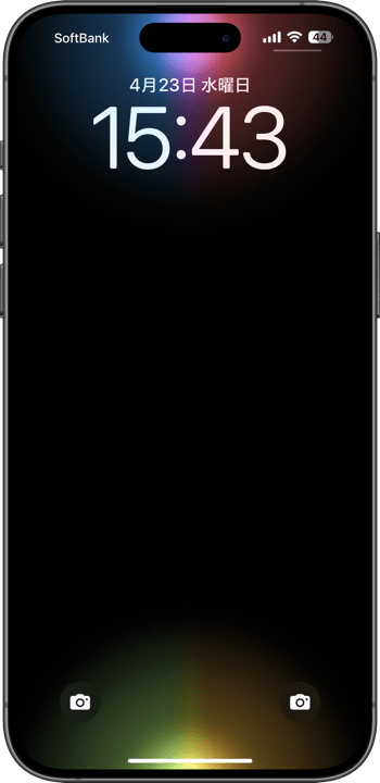
スリープ解除で点灯します。
大きめサイズのソフトな光源描写。
Lights up when waked.
Soft lighting in a larger size.
大きめサイズのソフトな光源描写。
Lights up when waked.
Soft lighting in a larger size.
5280×12008
Universal Wallpaper
Universal Wallpaper
How to Set
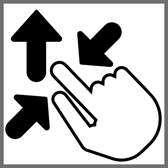
ピンチインして上に
「自然光/白黒」
ホーム画面の明暗はお好みで
常時表示オフ
───────────────
Pinch in then swipe up.
Natural or Black & White.
Home Screen brightness is up to you.
Always On Display Off
・
Help
「自然光/白黒」
ホーム画面の明暗はお好みで
常時表示オフ
───────────────
Pinch in then swipe up.
Natural or Black & White.
Home Screen brightness is up to you.
Always On Display Off
・
Help
サムネイルをタップしてダウンロード、
表示された画像を長押し保存してください。
───────────────
Tap the thumbnail to download.
Touch and hold the downloaded image to save it.
表示された画像を長押し保存してください。
───────────────
Tap the thumbnail to download.
Touch and hold the downloaded image to save it.
White

Gold

Pink

Red

Orange

Yellow
Green

Emerald

Blue

Purple

Rainbow

Siri
⚠️
⚠️
- 背景と要素の明暗差を保つ必要があるため、カラー調整で背景色を変えると効果が失われます。明るい屋外でも動きは悪くなります。
- 常時点灯モデルで「壁紙を表示」をオフにしても「常に画面オン」が有効だと動いては見えません。無効にしてお使いください。もちろん点灯するギミックを使わずにグラデーションを楽しむだけなら「常に画面オン」をオンにしていただいてかまいません。
- 画像形式をWebPにして高画質軽量化を図っています。iOS 14以降で表示できます。
⚠️
- Since the difference between light and dark must be maintained, changing the background color in the color adjustment will lose the effect. Movement will also be poor in bright outdoors.
- Models with Always On Display, even if Show Wallpaper is turned off, it will not appear to be moving if Always On Display is enabled. Please disable it. Of course, if you just want to enjoy the gradation without using the lighting gimmick, you can turn on Always On Display.
- The image format is WebP to make it high quality and lightweight. iOS 14 or later can display it.
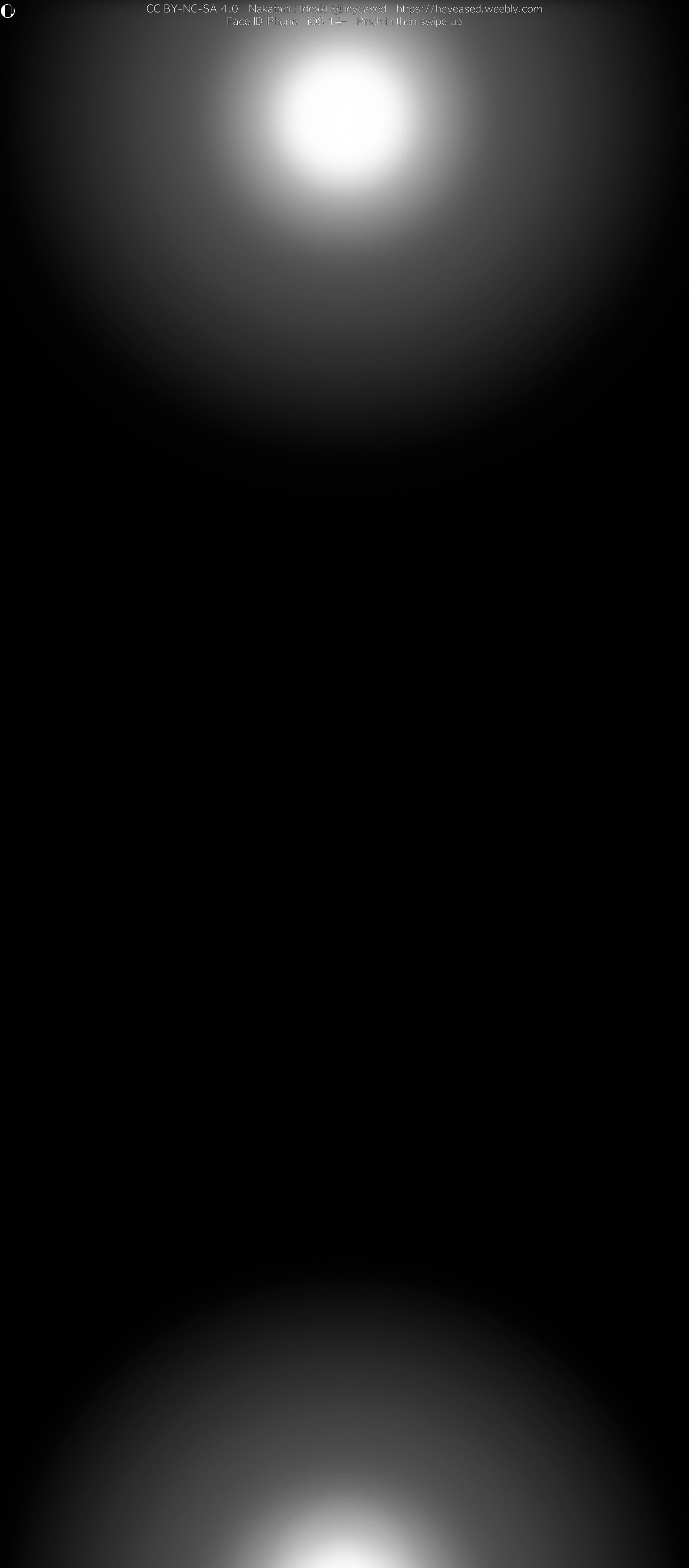
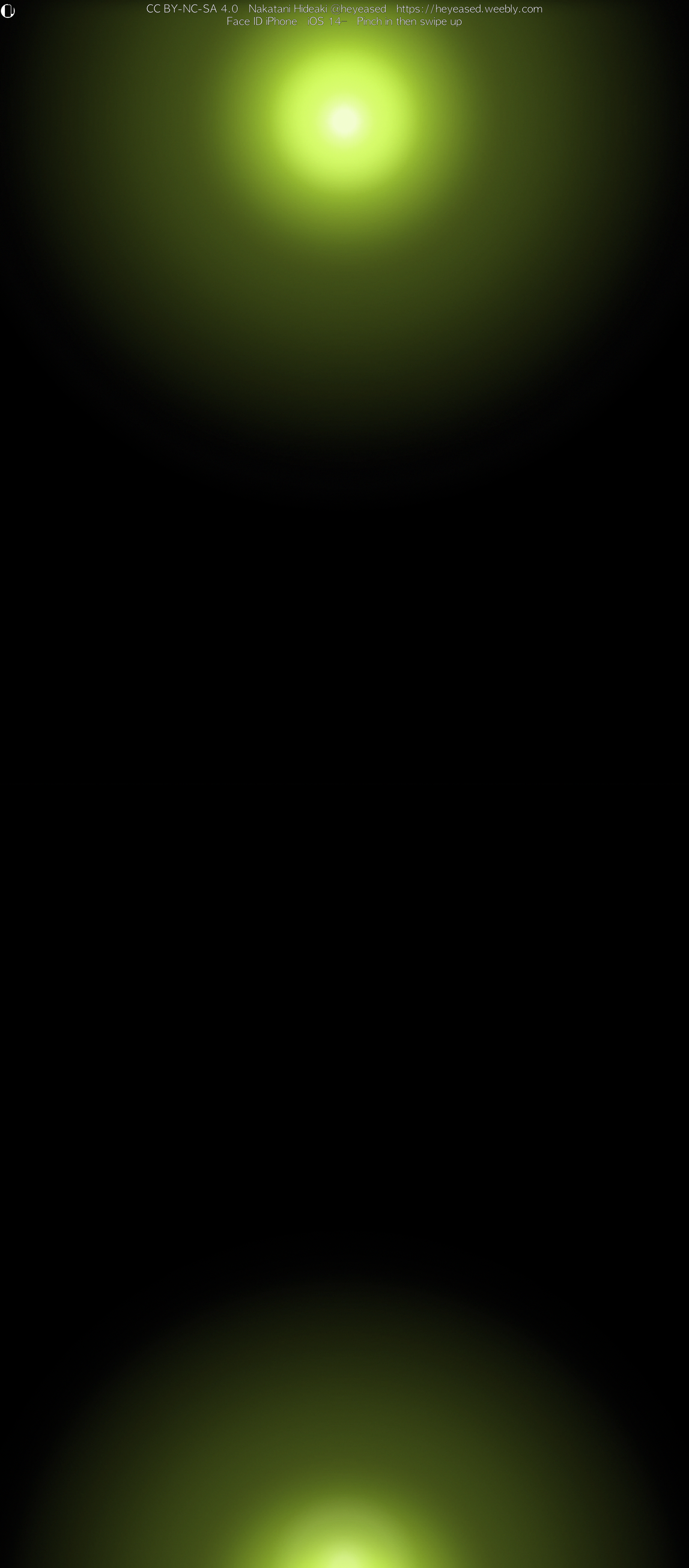
Face ID iPhoneではスリープ解除の瞬間に画面がゆっくり明るくなるため、黒い背景に明るいグラデーションがあると時間差で見えてきます。Appleは昔から待ち時間を感じさせないためにアニメーションを使ってきました。ゆっくり明るくなるのもFace IDの処理時間を感じさせない工夫なのでしょう。Touch ID iPhoneでは一瞬で見る暇もなく、Face IDでも新しい機種ほど時間が短く動きは急ぎ足になります。いずれは無くなるべきものなのかもしれません。
さてなだらかで距離が長いグラデーションではバンディングと呼ばれる縞が出やすくなります。背景が黒いと特に目立ちます。特にこの壁紙は中心と周辺に差をつけて周囲がゆっくり照らされるデザインですから、周囲はものすごくなだらかです。普通なら避けるべきデザインなのですが、なだらかさと距離の長さはアニメーション効果のためにどうしても欲しい。そのためにバンディングを極限まで減らすことがこの壁紙の命題です。グラデーションがなめらかなら動きもなめらかになります。
まず16 Pro Max用の半分のサイズで作ります。グラデーションの距離が短ければバンディングも出にくくなります。芯の残り方やぼかしの幅はスケールによって違うのです。しかし小さ過ぎると画像が荒れてしまいます。ここではハーフサイズがベストです。
次にカラーノイズをうっすらと乗せます。トーンの境界を崩すようなイメージでしょうか。不透明度は僅か1〜4%ですが色によって微妙に変える必要があるほど影響します。真っ黒な部分にノイズは必要ないのでその上にさらに黒いマスクを乗せます。
最後にそれを3倍にして出力、16 Pro Max用の1.5倍のサイズにします。画面よりも大きな画像を縮小表示させて少しでも高精細な描写を狙います。拡大してもハーフサイズで作ったグラデーションのバランスは維持されており、カラーノイズは3倍出力を見越して33%にしています。
大きなサイズとグラデーションに重ねたカラーノイズ、そして圧縮無しのためにシンプルなデザインですがデータサイズは大きめです。
On Face ID iPhones, the screen brightens slowly when waking from sleep, so a bright gradient on a black background reveals itself with a subtle delay. Apple has long used animations to disguise wait times, and this gradual fade is likely another trick to mask Face ID’s processing time. On Touch ID models, the display comes on instantly—there’s no time to notice—and even on Face ID devices, newer models wake faster and speed up the animation. Someday this effect may vanish entirely.
Long, gentle gradients spanning a wide distance are prone to “banding,” visible stripes that stand out especially on black backgrounds. This wallpaper deliberately contrasts a solid center with an extremely gradual periphery—making the outer gradient exceptionally smooth. Although such designs are normally avoided, that extended smoothness is essential for the wake‑up animation. Minimizing banding is this wallpaper’s core mission: when the gradient is smooth, the motion feels smooth too.
I begin by creating the image at half the resolution of the iPhone 16 Pro Max. Shorter gradient spans reduce banding, and scale affects how the blur’s core holds and how wide it spreads. Too small, however, and the image degrades—half size hits the sweet spot.
Next, I apply a very faint layer of color noise (about 1–4% opacity, adjusted per hue) to break up tone boundaries. Since pure black areas don’t benefit from noise, I mask those regions out.
Finally, I upscale the image 3×—resulting in a file 1.5× the size of the 16 Pro Max screen—while preserving the gradient’s balance. Displaying an oversized image downscaled on the device boosts perceived detail. The color noise is set to 33% in anticipation of this enlargement.
Despite its simple appearance, the oversized dimensions, layered color noise, and zero compression mean each file is relatively large.