全面グラス物語
The Full Glass Story
このぐらいがよくないですか。
Isn’t this just about right?
Isn’t this just about right?
➜ English
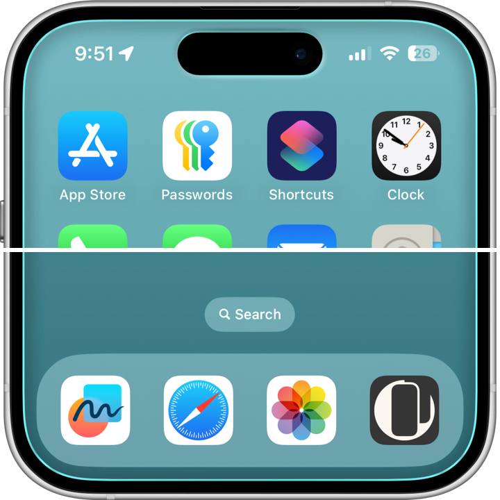
画面の縁をまるで本物のガラスふうに見せる壁紙です。本当にガラスですけど。
★
- 作ったのはiOS 18の時ですが仕様上はiOS 14以降で使えます。
- このページは2026年5月にまとめました。
iOS 18.7 (14.0)–
2025年6月 –
作った当時、手持ちのiPhoneは既にiOS 26ベータに上げてしまいましたが、iOS 18以前でも使える壁紙として作りました。
『縁取る壁紙』から流用したフレームに、ガラスふうの光沢と影の描写を加えてあります。背景はあまりくっきりさせず、リキッドグラスのフォルダでも変形しにくくしました。リキッド感を抑えてガラス感を出すコンセプトです。
このぐらいがいい塩梅だと思うんですよね。
『縁取る壁紙』から流用したフレームに、ガラスふうの光沢と影の描写を加えてあります。背景はあまりくっきりさせず、リキッドグラスのフォルダでも変形しにくくしました。リキッド感を抑えてガラス感を出すコンセプトです。
このぐらいがいい塩梅だと思うんですよね。
➜ キャンディカラーグラス壁紙
フレームの色は透明度を下げる設定にした時のドックやフォルダの縁の色です。
といっても実はベータ版初期の色。最初は全体から均等に色を拾っていたので、まさに画面全体にマッチしていました。
ベータの途中で端から拾うようになり、iOS 26.1で近場の色を拾うようになったので、新作を作るなら違うやり方が必要になりますね。
『縁取る壁紙』と同じくAir用はありません。各機種専用は更新停止中です。
フレームの色は透明度を下げる設定にした時のドックやフォルダの縁の色です。
といっても実はベータ版初期の色。最初は全体から均等に色を拾っていたので、まさに画面全体にマッチしていました。
ベータの途中で端から拾うようになり、iOS 26.1で近場の色を拾うようになったので、新作を作るなら違うやり方が必要になりますね。
『縁取る壁紙』と同じくAir用はありません。各機種専用は更新停止中です。
These wallpapers make the edges of the screen look like real glass. Though, it already is glass.
★
- This category was created during the iOS 18 era, but technically works on iOS 14 and later.
- This page was compiled in May 2026.
iOS 18.7 (14.0)–
June 2025 –
At the time of creation, my own iPhone had already been updated to the iOS 26 beta. Even so, I designed these wallpapers to work on iOS versions before 18 as well.
The frame reused elements from “Border Wallpapers,” with glass-like highlights and shadows added. The background is intentionally kept somewhat soft so it would resist distortion even with Liquid Glass folders. The concept was to reduce the “liquid” feel and bring out more of a true glass appearance.
I think this balance feels just right.
➜ Candy Colors Glass
The frame colors match the Dock and folder outline colors that appear when Reduce Transparency is enabled.
That said, these are actually colors from the early beta versions. At first, the system sampled colors evenly from the entire screen, so the effect truly matched the whole display.
Later during the beta cycle, it changed to sampling from the edges, and in iOS 26.1 it began sampling nearby colors instead. If I make new versions, they’ll need a different approach.
Like the “Border Wallpapers” series, there are no Air versions. Updates for device-specific versions are currently paused.