縁取る物語
The Border Story
そこはiPhoneのシンボルでした。
It was once a symbol of iPhone.
It was once a symbol of iPhone.
➜ English
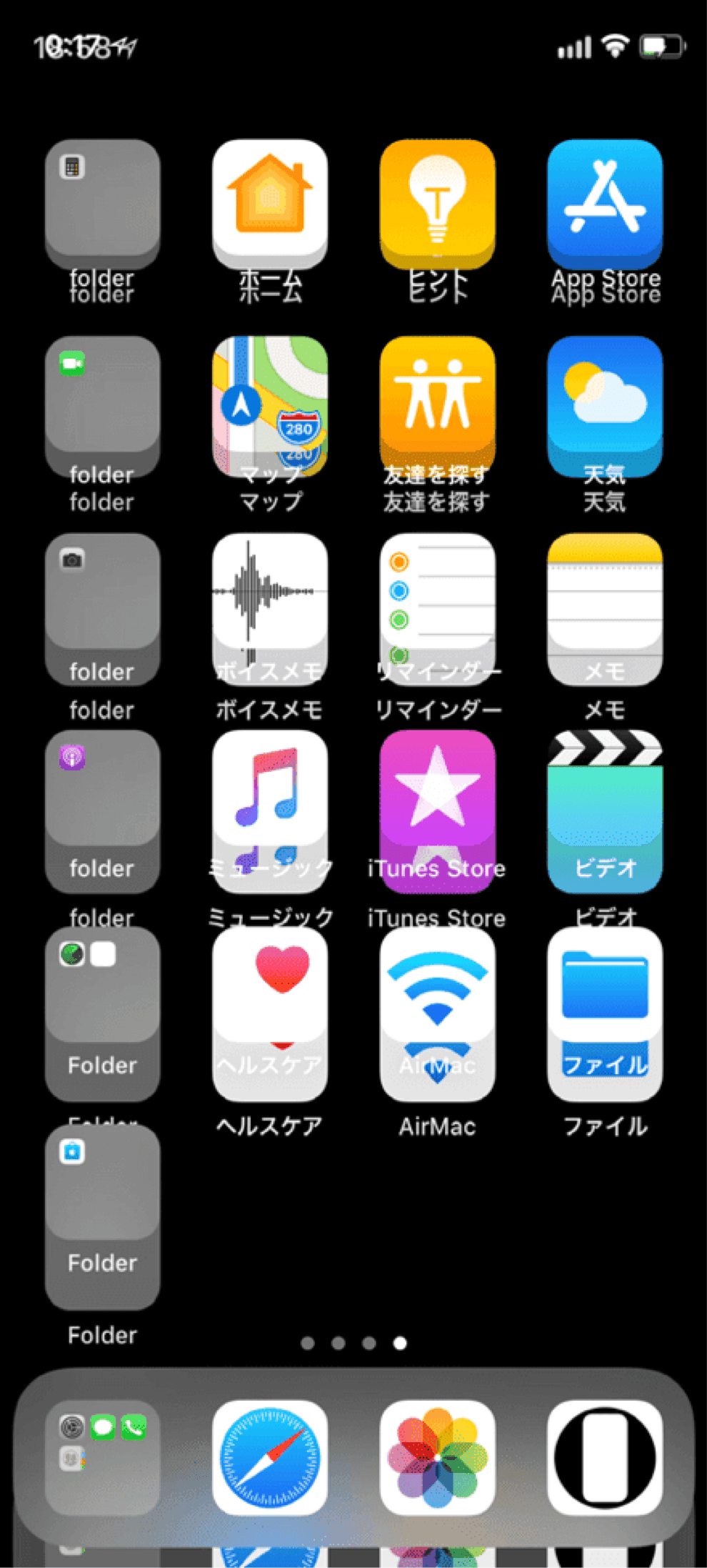
iPhone Xが発売されて話題になったのがセンサーハウジングのあるノッチでした。賛否両論、無かったら無い方がいい。
一方ですぐにコピースマホ(後述する複合カーブまでは真似する気もなさそうでしたが)が出たりして一時期はiPhoneのシンボルでもありました。
いっそノッチをかっこよく強調しようと、画面をぐるっと精密に囲むことを思いついたのです。
基本的にFace ID iPhone用のカテゴリーです。ホームボタンモデルではただの四角になる上にドックに邪魔されます。
★
- ドックを隠すタイプ、カラーにするタイプ、ロック画面をカスタマイズするタイプは省略しています。
- 設計図の壁紙などUIエレメントの変更も省略しています。フレーム表示とは別に細かいアップデートがたくさんありました。
- 代表的なトリックにスクショとリンクを添えて歴史をまとめています。
- 原則としてメジャーアップデート後の旧バージョンのマイナーアップデートは追跡していません。
- 対応OSのリリース期間を目安として表記しています。壁紙の公開とは必ずしも一致しません。
- このページは2026年5月にまとめました。
iOS 11.0–11.4
2017年9月 – 2018年9月
当時のiPhoneには視差効果という機能があり、画像を壁紙にするときに四方に余白を作る仕様になっていました。
その分拡大されるわけですが、非公表(iPhone 6以降情報なし)で規定のサイズがあったのです。上下左右の余白をピクセル単位で特定の値(アップデートでたびたび変更されていました)にすると、壁紙にした画像が等倍に表示されます。
なお設定時に「静止画」と「視差効果」を選ぶようになっていて、「視差効果」だと壁紙が動き「静止画」だと余白を残した基準位置で止まっていました。
iPhone Xが発売されて余白を調べると、視差効果ではほぼ真ん中なのに静止画だと大きく上に偏る仕様です。
そして静止画でぴったり合う表示位置がありません。なんと水平垂直方向に0.5ピクセルずつずれる仕様でした。それならとピンチインで全体表示を試みると壁紙が縦に引き伸ばされます。
画面を縁取る壁紙を作るには、規定サイズと0.5ピクセル単位の基準位置で作るのが当時唯一の正解だったのです。
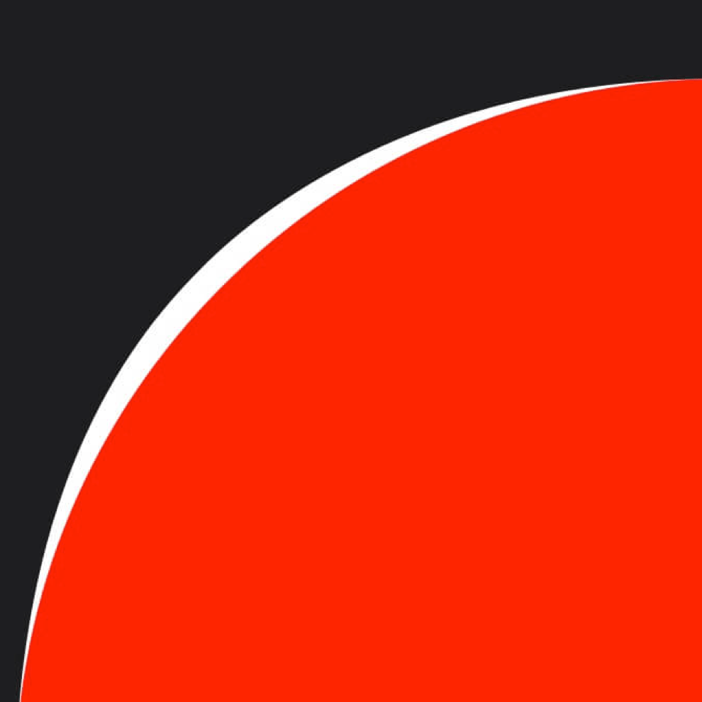
またコーナーは単純な角丸ではなく、途中で曲率が変わる複合カーブになっています。曲率が一つだと変化が急で美観、手触り、運動が滑らかにならないため、工業製品や高速道路のカーブなどで広く使われている手法です(下の画像では白が角丸、赤が複合カーブ)。ノッチはさらに複雑な形状ですが基本は同じ。
またコーナーは単純な角丸ではなく、途中で曲率が変わる複合カーブになっています。曲率が一つだと変化が急で美観、手触り、運動が滑らかにならないため、工業製品や高速道路のカーブなどで広く使われている手法です(下の画像では白が角丸、赤が複合カーブ)。ノッチはさらに複雑な形状ですが基本は同じ。
なので表示位置を突き止めただけでは終わりません。これらをぴったり縁取るには実機と肉眼が頼りです。
もちろんデジタルならではの理論はあります。そもそも、画像とは色の付いたピクセルの集合体。
1ピクセル単位で正確な位置に描かれた水平垂直の直線は1色で表現されますが、斜めの線や曲線の境界は必ず隣り合う色と混ざります。そうやって滑らかに見せているのです。
もちろんデジタルならではの理論はあります。そもそも、画像とは色の付いたピクセルの集合体。
1ピクセル単位で正確な位置に描かれた水平垂直の直線は1色で表現されますが、斜めの線や曲線の境界は必ず隣り合う色と混ざります。そうやって滑らかに見せているのです。
iPhoneの画面をぴったり縁取るフレームがあったとして内側をベゼルと同じ真っ黒に、外側を派手な色にするとどうなるでしょう。直線部分には何も見えず、曲がった所には色が混ざったヘアラインが見えるはずです。
ある程度アタリを付けたら100分の1ピクセル単位で微調整を繰り返して、ヘアラインがかすかに均一に見えるようにしていきます。
ある程度アタリを付けたら100分の1ピクセル単位で微調整を繰り返して、ヘアラインがかすかに均一に見えるようにしていきます。
縁取る壁紙の基本フレームは幅3ピクセルとしました。横に0.5ピクセルずれても、カーブの部分でも、本来の色が残る最低限の太さです。ずれたり曲がったりすると両側の1ピクセルは混色になりますが、真ん中の1ピクセルは元の色を保ちます。
➜ Xの壁紙
iOS 12.0–13.1
2018年9月 – 2019年9月
iOS 12では静止画にしても0.5ピクセルずらされることがなくなりました。

➜ 設計図の壁紙
iOS 13.2–13.7
2019年10月 – 2020年9月
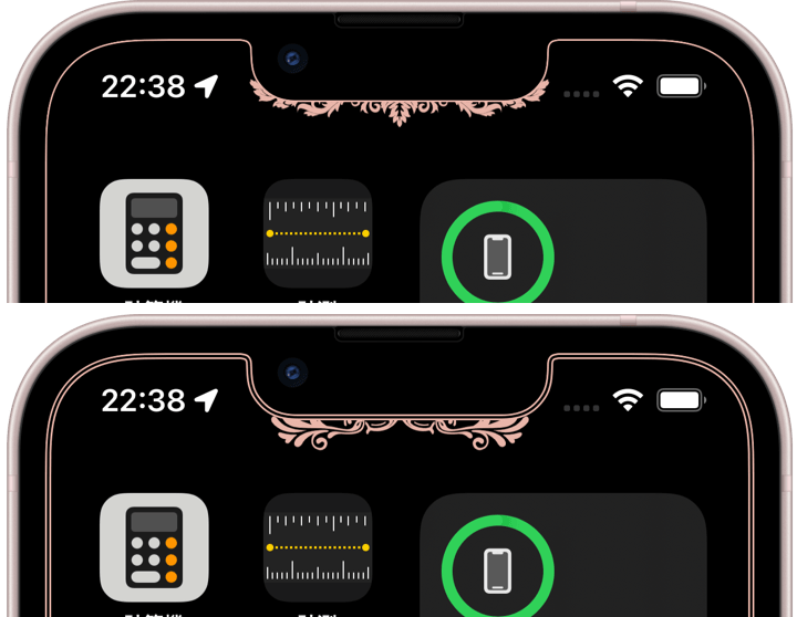
iOS 13.2で表示位置が上下中央寄りになりました。

➜ 核心を縁取る壁紙
iOS 14.0–15.7
2020年9月 – 2022年9月
表示位置が右に1ピクセル動きました(液晶画面の廉価版iPhoneでは変更なし)。
iOS 16.0 (14.0)–17.0
2022年10月 – 2023年10月
視差効果が廃止され、余白や表示位置という概念もなくなりました。
シンプルになるかと思いきや設定初期状態の表示位置が全画面だったり、拡大されてまちまちな位置に表示されたりとカオスな仕様です。
同じ機種で同じ壁紙なら同じ位置に表示されますが基準は不明。設定では基本的にピンチインが必須になりました。
iOS 16用ですがピンチしても変形しないiOS 14以降なら設定方法に従うだけで使えます。
シンプルになるかと思いきや設定初期状態の表示位置が全画面だったり、拡大されてまちまちな位置に表示されたりとカオスな仕様です。
同じ機種で同じ壁紙なら同じ位置に表示されますが基準は不明。設定では基本的にピンチインが必須になりました。
iOS 16用ですがピンチしても変形しないiOS 14以降なら設定方法に従うだけで使えます。

iOS 17.1 (14.0)–
2023年10月 –
iOS 17.1では上にスワイプする抜け道も塞がれました。画面サイズの壁紙では、たまたま全画面表示にならない限り必ず上がぼかされます。
ですが画面の縦横比よりも縦長の画像なら防げます(iOS 18.2以降は不安定で、横長でもぼかされない、ぼかせないこともあれば、ごく稀に縦長でもぼかされます)。上に余白を作って対処しました。
iOS16用と同じくiOS 14以降ならピンチインと上にスワイプで使えます。
ですが画面の縦横比よりも縦長の画像なら防げます(iOS 18.2以降は不安定で、横長でもぼかされない、ぼかせないこともあれば、ごく稀に縦長でもぼかされます)。上に余白を作って対処しました。
iOS16用と同じくiOS 14以降ならピンチインと上にスワイプで使えます。

➜ ザ・設計図の壁紙
しかし設計図の壁紙はここまでです。
iOS 18でホーム画面のカスタマイズが強化されて色々と位置が変わり、アイコンの大小も変更可能に。ドックの位置もアイコン次第で変わります。2つの設計図を重ねても絵になるレベルではありません。
その時点で画面サイズは12種類。両方を別の壁紙にすると24種類。もはや現実的な数ではなくなってきました。
実はそれまでも、画面サイズが増えるにつれて細かい瑕疵や不規則さ不安定さが積み重なって、内心設計図の壁紙は粗探しの壁紙だと思っていました。
ソフトウェアなんだから自由に動いてもいいというならそれはそう。かつては細部まで厳密だったiOSの設計思想ですが、それが薄れた今見かけだけの設計図に意味はありません。
ですがハードウェアのApple基準は変わっていません。見えない部分は安定しています。というわけで代わりにスワイプゾーンを可視化する壁紙を作りました。実用的でもあります。

➜ ザ・基本縁取り壁紙
画面サイズ別の壁紙は、始めた時の12倍13倍あるいはそれ以上の作業量になってしまいました。やっていたら作業に追われてアイデアを試す時間もありません。
今はこれまで作ったものが使えるので置いています。
Air用は作っていません。よほど時間を割く余裕ができるか、画面サイズが大幅に減る未来でもあれば作るかもしれません。
画面サイズ別の壁紙は、始めた時の12倍13倍あるいはそれ以上の作業量になってしまいました。やっていたら作業に追われてアイデアを試す時間もありません。
今はこれまで作ったものが使えるので置いています。
Air用は作っていません。よほど時間を割く余裕ができるか、画面サイズが大幅に減る未来でもあれば作るかもしれません。
When the iPhone X was released, one of the biggest topics was the notch with its sensor housing. Opinion was divided — though most would probably have preferred it not exist at all.
At the same time, copycat smartphones quickly appeared as well — though they did not seem willing to imitate the complex curves described later. For a while, the notch itself became a symbol of the iPhone.
That gave me an idea: instead of hiding the notch, frame the entire screen precisely to make it look deliberate.
This category was basically designed for Face ID iPhones. On Home button models, it simply becomes a rectangle, and the Dock gets in the way.
★
- Types that hide the Dock, coloring, or customize the Lock Screen are omitted here.
- Changes to UI elements such as blueprint wallpapers are also omitted. There were many small updates beyond the visible frame display itself.
- This is a historical overview of the major tricks, accompanied by screenshots and links.
- As a rule, I do not track minor updates for older iOS versions after a major update is released.
- Supported OS versions are listed based on their release periods and do not necessarily match the wallpaper release dates.
- This page was compiled in May 2026.
iOS 11.0–11.4
September 2017 – September 2018
At the time, iPhone had a feature called the Parallax Effect. When setting an image as wallpaper, the system automatically added margins around all sides.
That meant the image was enlarged. There was also an unpublished standard size — no official information existed after the iPhone 6 era. If the margins on each side matched certain pixel values exactly (values that frequently changed with updates), the wallpaper would display at true scale.
Back then, users could choose between “Still” and “Perspective” while setting wallpapers. With “Perspective,” the wallpaper moved. With “Still,” it stayed fixed at the base position while keeping the margins.
When the iPhone X launched and I investigated the margins, I discovered something strange. Under the Parallax Effect, the wallpaper was almost centered, but under Still mode it shifted heavily upward.
Worse, there was no perfectly aligned display position in Still mode. The wallpaper was offset by 0.5 pixels both horizontally and vertically. Trying to compensate by pinching inward caused the wallpaper to stretch vertically.
At the time, the only correct way to create a wallpaper that framed the screen was to design it using the exact standard size and the 0.5-pixel-based positioning system.
The corners were not simple rounded corners either. They used compound curves where the curvature changes midway. A single curve radius creates abrupt transitions that feel visually and physically less smooth. This technique is widely used in industrial design and even highway curves (In the image below, white indicates simple rounded corners, red indicates compound curves). The notch itself was even more complicated, though based on the same principle.
The corners were not simple rounded corners either. They used compound curves where the curvature changes midway. A single curve radius creates abrupt transitions that feel visually and physically less smooth. This technique is widely used in industrial design and even highway curves (In the image below, white indicates simple rounded corners, red indicates compound curves). The notch itself was even more complicated, though based on the same principle.
So discovering the display position was only the beginning. To frame these shapes perfectly, real devices and human eyesight were essential.
Of course, there was also digital theory behind it all.
Fundamentally, images are collections of colored pixels. Perfectly horizontal or vertical lines drawn exactly on pixel boundaries display as a single color. But diagonal lines and curves inevitably blend with neighboring colors at the edges. That blending is what makes them appear smooth.
Imagine a frame that perfectly outlines the iPhone display. If the inside were pure black matching the bezel, while the outside used vivid colors, what would happen? Straight sections would become invisible, while curved areas would reveal faint hairline colors created by the blending.
Once I got reasonably close, I repeatedly adjusted the positioning in increments as small as one-hundredth of a pixel until the hairlines appeared faint and evenly balanced.
Once I got reasonably close, I repeatedly adjusted the positioning in increments as small as one-hundredth of a pixel until the hairlines appeared faint and evenly balanced.
The standard frame width for border wallpapers became 3 pixels. That was the minimum thickness where the original color would survive even with 0.5-pixel offsets or around curves. When lines shift or curve, the outer 1-pixel edges become blended colors, but the center 1 pixel preserves the original color.
iOS 12.0–13.1
September 2018 – September 2019
In iOS 12, wallpapers were no longer shifted by 0.5 pixels in Still mode.
iOS 13.2–13.7
October 2019 – September 2020
In iOS 13.2, the display position moved closer to the vertical center.
iOS 14.0–15.7
September 2020 – September 2022
The display position shifted 1 pixel to the right. Budget iPhones with LCD displays remained unchanged.
➜ Floral Border 2
Also, pinching inward during wallpaper setup no longer stretched the image vertically.
Also, pinching inward during wallpaper setup no longer stretched the image vertically.
iOS 16.0 (14.0)–17.0
October 2022 – October 2023
The Parallax Effect was removed, and with it the entire concept of margins and fixed display positions disappeared.
You might expect things to become simpler, but instead the system became chaotic. Sometimes the initial setup position displayed the wallpaper full screen, other times it appeared enlarged and inconsistently placed.
The same wallpaper on the same device still displayed identically, but the reference logic became unclear. Pinching inward during setup effectively became mandatory.
Although designed for iOS 16, these wallpapers can also be used on iOS 14 and later as long as the setup instructions are followed, since pinching no longer distorts the image.
➜ Double Screen Border
In iOS 17.0, pinching during setup began blurring the upper portion of the screen. However, this could still be avoided by pinching inward while simultaneously swiping upward.
In iOS 17.0, pinching during setup began blurring the upper portion of the screen. However, this could still be avoided by pinching inward while simultaneously swiping upward.
iOS 17.1 (14.0)–
October 2023 –
In iOS 17.1, even that workaround was blocked. With wallpapers matching the screen size, the top area will always blur unless the wallpaper happens to display full screen by chance.
However, this can be prevented by using images taller than the screen’s aspect ratio (Since iOS 18.2 the behavior has become unstable — sometimes even wide images avoid blur, while in rare cases tall images blur anyway). I dealt with this by adding extra margin space at the top.
Like the iOS 16 versions, these can still be used on iOS 14 and later through pinching inward and swiping upward during setup.
➜ The Blueprint
But this is where blueprint wallpapers effectively end.
In iOS 18, Home Screen customization expanded dramatically. Many interface positions changed, icon sizes became adjustable, and even the Dock position shifted depending on icon layout. Using two blueprint wallpapers together — one for each screen — no longer produced a visually coherent result.
At that point there were already 12 different screen sizes. Separate wallpapers for both Lock Screen and Home Screen would mean 24 variations. The number had stopped being realistic.
In truth, even before that, increasing screen sizes had gradually accumulated tiny flaws, irregularities, and instabilities. Deep down, I had started feeling that blueprint wallpapers were becoming wallpapers for finding imperfections.
If software should remain free to move dynamically, then fair enough. iOS once followed a design philosophy obsessed with precision down to the smallest detail. But now that philosophy has faded, blueprints that only imitate appearances no longer hold meaning.
However, Apple’s hardware standards themselves have not changed. The invisible foundations remain stable. So instead, I created wallpapers that visualize swipe zones. They are practical as well.
➜ The Basic Border
Creating wallpapers for every screen size eventually became twelve or thirteen times more work than when I first started — possibly even more. If I continued, I would spend all my time chasing production work instead of experimenting with ideas.
For now, I keep the older works available because they still function.
I never created versions for Air models. Perhaps if I someday gain an enormous amount of free time — or if screen sizes drastically decrease in the future — I might reconsider.