ドックを隠す物語
The Hide Dock Story
愛用の棚壁紙が使えなくなったから。
Because my favorite shelf wallpaper stopped working.
Because my favorite shelf wallpaper stopped working.
➜ English
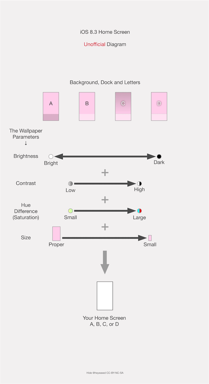
ドックとその背景を同じ色にしてドックを見えなくする壁紙です。
その仕組みはiOSのアップデートで変わってきました。
★
ドックとその背景を同じ色にしてドックを見えなくする壁紙です。
その仕組みはiOSのアップデートで変わってきました。
★
- 一部マイクロサイズの壁紙には最新iOSで長押し保存できないものがあります。
- 代表的なトリックにスクショとリンクを添えて歴史をまとめています。
- 細かい閾値の変更は省略しています。実際にはもっと多くのバージョンがありました。
- トリックによって仕様が変更されたiOSのバージョンが異なるため、後に作られたトリックが先に使えなくなることもあります。
- 原則としてメジャーアップデート後の旧バージョンのマイナーアップデートは追跡していません。
- 対応OSのリリース期間を目安として表記しています。壁紙の公開とは必ずしも一致しません。
- このページは2026年5月にまとめられました。
iOS 7.0
2013年9月 – 2014年3月
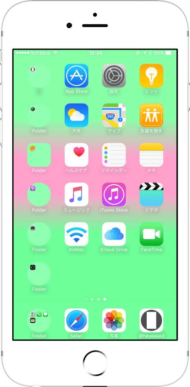
iOS 7でフラットデザインになり、ドックに半透明ぼかしエフェクトが導入されました。これがなぜか嫌われることはあっても好かれることは稀です。
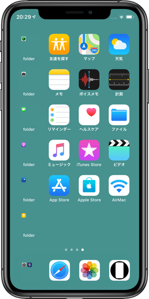
それまで愛用してた棚壁紙が合わなくなって代わりを探しているうちに、淡いクリーム色の部分でフォルダの境界が見えなくなっていることに気づきました。
それならと全面クリーム色の背景を作って少しずつ微調整、ホーム画面のドックとフォルダが見えなくなる色を特定します。
それまで愛用してた棚壁紙が合わなくなって代わりを探しているうちに、淡いクリーム色の部分でフォルダの境界が見えなくなっていることに気づきました。
それならと全面クリーム色の背景を作って少しずつ微調整、ホーム画面のドックとフォルダが見えなくなる色を特定します。

➜ 無名の壁紙
これを理解した経緯は後にしてまずは仕組みから。
iOS 7のドックは背景が一定以上の明るさを持っているときは暗く、それより暗いときは明るくなっていました。明るさは壁紙全体で測定されます。
ドックの明るさ暗さには上限下限があって、白や一定の淡い色ではそれ以上明るくなれません。
全体の明るさが一定以下で、かつドックやフォルダの境界部分の背景が上限以上の明るさだと、同じ色になって見えなくなっていたのです。
ちなみにこの時まだダークモードはなくて、限界は明るい方にだけ偏っています。
そこで「暗さ」をドックの下に濃い帯として集めて、全ての境界を見えなくする壁紙を作りました。
これを理解した経緯は後にしてまずは仕組みから。
iOS 7のドックは背景が一定以上の明るさを持っているときは暗く、それより暗いときは明るくなっていました。明るさは壁紙全体で測定されます。
ドックの明るさ暗さには上限下限があって、白や一定の淡い色ではそれ以上明るくなれません。
全体の明るさが一定以下で、かつドックやフォルダの境界部分の背景が上限以上の明るさだと、同じ色になって見えなくなっていたのです。
ちなみにこの時まだダークモードはなくて、限界は明るい方にだけ偏っています。
そこで「暗さ」をドックの下に濃い帯として集めて、全ての境界を見えなくする壁紙を作りました。

➜ 最初の白い壁紙
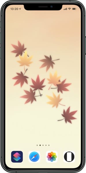
iOS 7でフラットデザインと同時に導入された視差効果は画面には表示されない余白を要求。それらも明るさ判定の範囲内です。
左右に比べてマージンが広い上や、上下に分割して黒い帯を置けばもっと隠せます。
ドックかフォルダが黒を拾ってやや滲むものの、それ以外は全面真っ白でドックとフォルダを隠すことに成功。
iOS 7でフラットデザインと同時に導入された視差効果は画面には表示されない余白を要求。それらも明るさ判定の範囲内です。
左右に比べてマージンが広い上や、上下に分割して黒い帯を置けばもっと隠せます。
ドックかフォルダが黒を拾ってやや滲むものの、それ以外は全面真っ白でドックとフォルダを隠すことに成功。


➜ iPad用最初の白い壁紙
余談ですが、当時はホーム画面とロック画面の表示範囲が同じだと、余白が違ってもホーム画面の壁紙がロック画面に乗っ取られるバグがありました。
ドックはホーム画面にしかないのだからロック画面はただの白でいいだろうとやるとダメだったんです。両方白くしたいならロック画面にもドックを隠す壁紙を使わないといけませんでした。
さてどうやって仕組みを理解したか。
一人で始めたことではありません。
最初に作ったクリーム色の壁紙は普通の写真と一緒にFlickrに公開していました。
ほぼ同時期にとあるサイトが、上がグラデーション、下半分が白くてドックが見えなくなる壁紙を公開しているのを見つけます。
Twitterでクリーム色を見せて作り方を話しているうちに、暗さを稼ぐという共通の仕組みを理解。
それで逆にドックの下に帯を入れることを思いつき、さらに完璧を求めたのが上の帯と上下の帯でした。
私は彼にアイデアを提供して公開してもらいました。ただアイデアを出せていればよかったのです。
しかしやりとりするうちに様子がおかしくなってきました。彼は自身のサイトで私に教えてもらったと言っていたアイデアを、自分が考えたと言い始めたのです。最初は付いていたFlickrへのリンクも削除されました。
それでいて連絡は取ってきます。都合よくゴーストクリエイターとして使えるとでも?
この続きはまた後で。
iOS 7.1
2014年3月 – 2014年9月
背景が必ず暗くなるようになって、明るさの上限を利用したドックを隠すトリックは使えなくなりました。
しかし視差効果をオフにして固定すれば、明るくされたドックやフォルダと暗くされた背景を中和して同じ色にすることは可能です。
更に「透明度を下げる」をオンにするとドックとフォルダは背景に関係なく一定のグレーになるので、これも暗くなることを見越した明るさで、その色を背景にする壁紙も作りました。
しかし視差効果をオフにして固定すれば、明るくされたドックやフォルダと暗くされた背景を中和して同じ色にすることは可能です。
更に「透明度を下げる」をオンにするとドックとフォルダは背景に関係なく一定のグレーになるので、これも暗くなることを見越した明るさで、その色を背景にする壁紙も作りました。

➜ 無境界壁紙
iOS 8.0–9.3
2014年9月 – 2016年9月
背景が常に暗くなる仕様が廃止(鮮やかな背景は依然暗くされていましたが)され、再びiOS 7と同じトリックが使用可能に。
ただしまったく同じではなく、ドックやフォルダの滲みは強くなっていました。
それで閾値をギリギリまで追求。
➜ 白の壁紙 バージョン5
明暗の判定基準には明るさだけではなく彩度も含まれることも利用。
➜ 白の壁紙 iPhone用統合版
明るさ上限の淡い色だけで暗さも稼げる壁紙は、カラバリを5色に。それらを混ぜたグラデーションをドックのぼかしエフェクトに同化させるトリックも開発。
➜ 境界のない色の壁紙
「透明度を下げる」の色に合わせた壁紙も暗くならない仕様になりました。
ただしまったく同じではなく、ドックやフォルダの滲みは強くなっていました。
それで閾値をギリギリまで追求。
➜ 白の壁紙 バージョン5
明暗の判定基準には明るさだけではなく彩度も含まれることも利用。
➜ 白の壁紙 iPhone用統合版
明るさ上限の淡い色だけで暗さも稼げる壁紙は、カラバリを5色に。それらを混ぜたグラデーションをドックのぼかしエフェクトに同化させるトリックも開発。
➜ 境界のない色の壁紙
「透明度を下げる」の色に合わせた壁紙も暗くならない仕様になりました。

私は彼の壁紙を紹介したことのある全てのメディアに、独自に公開したこの壁紙と仕組みを売り込んで記事にしてもらうと同時に、彼にカラーUIのトリックを伝えました。
彼は似たような結果になる物を遅れて公開。
一人で始めたことではありませんでしたが、一人で続けることになりました。
彼は似たような結果になる物を遅れて公開。
一人で始めたことではありませんでしたが、一人で続けることになりました。
iOS 8.3–9.3
2015年4月 – 2016年9月
壁紙の明るさ判定に壁紙のサイズが関連付けられました。
視差効果のための余白も含めた規程のサイズを基準に、それより小さければ小さいほど暗いと判定されます(規程より大きくても明るいとは判定されませんでした)。
視差効果のための余白も含めた規程のサイズを基準に、それより小さければ小さいほど暗いと判定されます(規程より大きくても明るいとは判定されませんでした)。
ただ小さいだけの真っ白な壁紙で適度な「暗さ」を稼いで、ついにドックと全てのフォルダを完全に白くすることが可能に。

➜ ほんとうに真っ白な壁紙(オールF)
サイズの暗さ変換率はその後たびたび変更され、その度に対応バージョンを作ることになります。
当時は暗い壁紙だと設定後はもっと暗くされる仕様でした。小さなサイズのカラーUIの壁紙で明るかったバージョンが暗くされたことで、小ささが暗さと等価になったと気づいたのです。
サイズの暗さ変換率はその後たびたび変更され、その度に対応バージョンを作ることになります。
当時は暗い壁紙だと設定後はもっと暗くされる仕様でした。小さなサイズのカラーUIの壁紙で明るかったバージョンが暗くされたことで、小ささが暗さと等価になったと気づいたのです。
iOS 9.3–10.3
2016年3月 – 2017年9月
壁紙が規程よりも小さければ小さいほど、ドックが壁紙周辺部の色を強く拾う(この仕様自体はiOS 8から)ことを利用して、離れた所にある色を混ぜてドックと背景を同じ色にするシリーズも作成。
カラーUIの壁紙の、背景とドックの色を揃えるバージョンです。
カラーUIの壁紙の、背景とドックの色を揃えるバージョンです。
iOS 10.0–10.1
2016年9月 – 2016年12月
再びすべての壁紙が暗くされ、それまでのドックを隠す壁紙は機能しなくなります。
しかし1×1ピクセルの壁紙ではドックとフォルダが壁紙の色をそのまま出すことを発見。1×1の真っ黒ではドックとフォルダは真っ黒、背景もそれ以上暗くできないので真っ黒のまま、全面真っ黒のホーム画面が可能になりました。
折しも発売間近のiPhone 7ジェットブラックとも完璧にマッチします。
しかし1×1ピクセルの壁紙ではドックとフォルダが壁紙の色をそのまま出すことを発見。1×1の真っ黒ではドックとフォルダは真っ黒、背景もそれ以上暗くできないので真っ黒のまま、全面真っ黒のホーム画面が可能になりました。
折しも発売間近のiPhone 7ジェットブラックとも完璧にマッチします。

➜ 1色にする壁紙
サイズに起因するバグのようなものなのでiPadは持っていない限り分からず、サイト的にはサポートしていません。
後にiPadOS 13として独立してからはMacに近い縁のあるドックになり、ドックを隠す壁紙の対象ではなくなります。
サイズに起因するバグのようなものなのでiPadは持っていない限り分からず、サイト的にはサポートしていません。
後にiPadOS 13として独立してからはMacに近い縁のあるドックになり、ドックを隠す壁紙の対象ではなくなります。
iOS 10.2–10.3
2016年12月 – 2017年9月
iOS 10.2で背景が必ず暗くなる仕様が再び廃止。全面真っ白な壁紙が復活。
➜ 魔法の白い壁紙
しかし1ピクセルサイズの壁紙は効かなくなり、2ピクセルや3ピクセルで延命を図りましたが全機種で使えるわけではなく、条件もややこしいことになっていました。
➜ 魔法の黒い壁紙 マイナス +x
➜ 魔法の白い壁紙
しかし1ピクセルサイズの壁紙は効かなくなり、2ピクセルや3ピクセルで延命を図りましたが全機種で使えるわけではなく、条件もややこしいことになっていました。
➜ 魔法の黒い壁紙 マイナス +x
iOS 11.0–12.4
2017年9月 – 2019年9月
iOS 11で小さなサイズの画像とドック、フォルダ、明るさ判定の紐付けが廃止されました。小さ過ぎると設定もできず、ドックを隠す黒い壁紙も完全に不可能に。
iOS 7.0と同じトリックは残りました。
➜ 全部白い壁紙 2
ドックを正確に型取る技術を応用してぴったりの位置に中和色を置く壁紙も作りました。
この方法自体はアップデートの影響は受けませんが、機種別に作らなければならず、画面サイズの増加やアップデートによる表示位置の変更などで次第に作らなくなっていきます。
iOS 7.0と同じトリックは残りました。
➜ 全部白い壁紙 2
ドックを正確に型取る技術を応用してぴったりの位置に中和色を置く壁紙も作りました。
この方法自体はアップデートの影響は受けませんが、機種別に作らなければならず、画面サイズの増加やアップデートによる表示位置の変更などで次第に作らなくなっていきます。
iOS 12.0–15.7
2018年9月 – 2022年9月
透明度を下げたときのドックとフォルダの色がグレーだけではなく、背景全体の色を拾って彩度と明るさを下げたものに。
そして背景の明るさによって暗くなったり明るくなったりするルールが、「透明度を下げる」のドックとフォルダにも適用されました。
明暗が入れ替わる境界の色では背景のグレーと同じ色になります。
そして背景の明るさによって暗くなったり明るくなったりするルールが、「透明度を下げる」のドックとフォルダにも適用されました。
明暗が入れ替わる境界の色では背景のグレーと同じ色になります。
➜ 最もストイックな壁紙 5
背景の色を拾うなら、視差効果の余白を利用して色を中和する技術がここで再び生きてきます。
なおiOS 12.1で壁紙が暗くなるときのドックの色が若干変わりました。中和タイプは12.1の時に作っています。
背景の色を拾うなら、視差効果の余白を利用して色を中和する技術がここで再び生きてきます。
なおiOS 12.1で壁紙が暗くなるときのドックの色が若干変わりました。中和タイプは12.1の時に作っています。
➜ イレイザー壁紙
その後iOS 16の視差効果廃止に伴い余白を使ったトリックは使えなくなりました。
透明度を下げるトリック自体も、時間が経つと色が変わるなどの不安定化でドックを隠す壁紙としては使わなくなります。
その後iOS 16の視差効果廃止に伴い余白を使ったトリックは使えなくなりました。
透明度を下げるトリック自体も、時間が経つと色が変わるなどの不安定化でドックを隠す壁紙としては使わなくなります。
iOS 13.0–15.7
2019年9月 – 2022年9月
iOS 13でダークモードが導入され、ドックを隠す壁紙も同じ原理で2つの閾値が発生。
ライトモードではドックの色は原則として背景を明るくするものの、明るさに上限が設けられました。ダークモードでは逆に暗さの下限があります。
濃過ぎて暗くされる場合を除いて明るさ判定に意味はなくなり、それぞれ上限、下限ぴったりの色で作るトリックになりました。
完全な黒や白ではありませんが、ドックを隠す安定した黒と白を同時にリリースできたのです。
ライトモードではドックの色は原則として背景を明るくするものの、明るさに上限が設けられました。ダークモードでは逆に暗さの下限があります。
濃過ぎて暗くされる場合を除いて明るさ判定に意味はなくなり、それぞれ上限、下限ぴったりの色で作るトリックになりました。
完全な黒や白ではありませんが、ドックを隠す安定した黒と白を同時にリリースできたのです。


iOS 16.0–18.7
2022年9月 – 2025年9月
iOS 16で視差効果が廃止。ドックを隠す色に変更はありませんが、サイト全体のほぼ全ての壁紙のレイアウトを直しました。
iOS 15までは別カテゴリーだった『ドックを隠す四季の壁紙』もドックを隠す壁紙に統合。
iOS 15までは別カテゴリーだった『ドックを隠す四季の壁紙』もドックを隠す壁紙に統合。
iOS 26.0–
2025年9月 –
リキッドグラスデザインの導入でドックを完全に隠すことはできなくなりました。エッジにガラスの反射のようなエフェクトが加わります。
しかし各モードの上限下限の色に合わせることは可能。iPhone 13以前ではガラスエフェクトのない部分が背景に溶け込み、iPhone14以降では傾きに伴うエフェクトの移動でドックの境界が見え隠れするトリックに。
上限がかなり低くなり下限がかなり高くなったことで、淡過ぎることも暗過ぎることもなくいい感じです。
有機EL画面の機種では実機とスクリーンショットでドックの色が違うため、肉眼で色を合わせてあります。
しかし各モードの上限下限の色に合わせることは可能。iPhone 13以前ではガラスエフェクトのない部分が背景に溶け込み、iPhone14以降では傾きに伴うエフェクトの移動でドックの境界が見え隠れするトリックに。
上限がかなり低くなり下限がかなり高くなったことで、淡過ぎることも暗過ぎることもなくいい感じです。
有機EL画面の機種では実機とスクリーンショットでドックの色が違うため、肉眼で色を合わせてあります。

➜ ダークニンジャドック壁紙
透明度を下げてドックが暗くなる設定の時は、ドックの下限がiOS 13から18までのダークモードよりもさらに黒くなりました。
こちらはスクショとの差や画面の種類によるばらつきもなく、iPadでも使えます。
透明度を下げてドックが暗くなる設定の時は、ドックの下限がiOS 13から18までのダークモードよりもさらに黒くなりました。
こちらはスクショとの差や画面の種類によるばらつきもなく、iPadでも使えます。
These are wallpapers that make the Dock disappear by matching the Dock and its background to the same color.
The mechanism changed with the iOS updates.
★
- Some micro-sized wallpapers can no longer be saved by long-pressing on the latest iOS versions.
- This is a historical overview of the major tricks, accompanied by screenshots and links.
- Minor threshold adjustments are omitted. In reality, there were even more variations.
- Because each trick depended on different iOS behaviors, some newer tricks stopped working before older ones.
- As a rule, I do not track minor updates for older iOS versions after a major update is released.
- Supported OS versions are listed based on their release periods and do not necessarily match the wallpaper release dates.
- This page was compiled in May 2026.
iOS 7.0
September 2013 – March 2014
With iOS 7, Apple introduced flat design along with the translucent blurred Dock effect. Somehow it earned dislike more often than affection.
My favorite shelf wallpapers no longer looked right, and while searching for alternatives, I noticed that the folder borders disappeared against pale cream-colored backgrounds.
That led me to create a fully cream-colored wallpaper and gradually fine-tune it until I identified the exact color that made both the Dock and folders disappear on the Home Screen.

➜ Untitled Wallpaper
Before explaining how I understood this behavior, here is the mechanism itself.
In iOS 7, the Dock became dark when the wallpaper background exceeded a certain brightness threshold, and bright when it fell below it. The brightness measurement was based on the wallpaper as a whole.
There were upper and lower limits to the Dock’s brightness adjustments. Pure white and certain pale colors could not become any brighter.
If the overall wallpaper brightness remained below a certain threshold while the Dock and folder border areas themselves exceeded the maximum brightness limit, the colors became identical and visually disappeared.
At the time, Dark Mode did not yet exist, so the limitation only existed on the bright side.
So I concentrated the required “darkness” into a dark band beneath the Dock, creating wallpapers that hid every border completely.
➜ The 1st White Wallpapers
The Parallax Effect introduced alongside flat design in iOS 7 required invisible margins around wallpapers. Those margins were also included in the brightness calculations.
By placing black bands above the visible area or dividing darkness top and bottom, I could hide even more. The Dock and folders sometimes sampled slight darkness and blurred a little, but otherwise I succeeded in creating completely white wallpapers that hid both the Dock and folders.
➜ 2nd Generation White Wallpapers
For iPad versions, black elements were placed in the corners so the wallpapers worked in both portrait and landscape orientations
For iPad versions, black elements were placed in the corners so the wallpapers worked in both portrait and landscape orientations
➜ The 1st White Wallpaper for iPad
As an aside, back then there was also a bug where the Home Screen wallpaper could overwrite the Lock Screen wallpaper if their visible areas matched, even when their margins differed.
Since the Dock only existed on the Home Screen, you might think a plain white Lock Screen would work fine — but it did not. If you wanted both screens white, you had to use Dock-hiding wallpapers on the Lock Screen as well.
Now then, how did I figure out the mechanism?
I did not begin alone.
The first cream-colored wallpaper I created was uploaded to Flickr alongside ordinary photographs.
At almost the same time, I found another website publishing wallpapers where the top half used a gradient while the lower half became white to hide the Dock.
While discussing my cream-colored wallpapers and methods on Twitter, I realized we were both relying on the same principle: accumulating darkness.
That realization inspired me to place a dark band directly beneath the Dock. Then, seeking perfection, I expanded the idea into the upper band and divided the top and bottom bands.
I shared the ideas with him, and he published them. At the time, simply contributing ideas was enough for me.
But as we exchanged ideas, something started to feel off. On his own site, he began claiming as his own what he had previously admitted learning from me. Even the Flickr links he had originally included were removed.
And yet he still contacted me afterward. Did he think I could conveniently remain an invisible ghost creator for him?
More on that later.
iOS 7.1
March 2014 – September 2014
Backgrounds now always darkened automatically, making the old brightness-limit Dock-hiding trick unusable.
However, by disabling parallax and fixing the wallpaper position, it became possible to neutralize the brightened Dock and folders against the darkened wallpaper so they matched again.
Furthermore, enabling “Reduce Transparency” caused the Dock and folders to become a fixed gray regardless of the wallpaper background. Knowing the wallpaper itself would darken, I created wallpapers with brightness specifically adjusted to match that gray.
iOS 8.0–9.3
September 2014 – September 2016
The system that always darkened wallpapers was removed, though vivid wallpapers still darkened somewhat. This allowed the original iOS 7 trick to work once again.
However, the behavior was not identical. The Dock and folders blurred more strongly than before.
So I pushed the thresholds as far as possible.
➜ White ver.5
I also took advantage of the fact that the brightness evaluation considered saturation in addition to brightness itself.
➜ White for iPhone Integrated
Wallpapers using only pale colors at the brightness limit while still accumulating enough “darkness” expanded into five color variations. I also developed tricks using gradients blending those colors into the Dock blur effect itself.
➜ Seamless Colors
Meanwhile, wallpapers matching the “Reduce Transparency” color no longer darkened automatically.
➜ Stoic
As for the person who tried turning me into a ghost creator--
iOS 8 also made the opposite kind of trick possible: Color UI Wallpapers that colored the Dock and folders.
As for the person who tried turning me into a ghost creator--
iOS 8 also made the opposite kind of trick possible: Color UI Wallpapers that colored the Dock and folders.
I independently promoted my own wallpapers and explanations to every media outlet that had previously featured his wallpapers, getting articles published about them. At the same time, I explained the Color UI trick directly to him.
He published something that produced similar results — belatedly.
I had not started alone. But from that point onward, I continued alone.
He published something that produced similar results — belatedly.
I had not started alone. But from that point onward, I continued alone.
iOS 8.3–9.3
April 2015 – September 2016
Wallpaper brightness evaluation became linked to wallpaper size.
Using the official wallpaper dimensions including parallax margins as a reference, smaller wallpapers were judged progressively darker. Larger wallpapers, however, were never judged brighter.
Using the official wallpaper dimensions including parallax margins as a reference, smaller wallpapers were judged progressively darker. Larger wallpapers, however, were never judged brighter.
This finally made it possible to create perfectly white Docks and folders using nothing more than pure white wallpapers shrunk small enough to generate the required “darkness.”
➜ FFFFFF (All F)
The darkness conversion rate tied to wallpaper size changed repeatedly afterward, forcing me to create separate versions for each behavior.
At the time, dark wallpapers became even darker after being applied. When certain small Color UI wallpapers that originally appeared bright suddenly darkened after setup, I realized wallpaper smallness itself had effectively become equivalent to darkness.
iOS 9.3–10.3
March 2016 – September 2017
Taking advantage of the behavior where increasingly small wallpapers caused the Dock to sample edge colors more strongly — a behavior that actually began in iOS 8 — I also created wallpapers that blended distant colors together so the Dock and background became identical.
Essentially, these were versions of Color UI wallpapers where the background and Dock matched each other.
Essentially, these were versions of Color UI wallpapers where the background and Dock matched each other.
➜ Full Screen with Accent
During this period, tiny wallpapers also caused folders to become rounded in some places.
During this period, tiny wallpapers also caused folders to become rounded in some places.
iOS 10.0–10.1
September 2016 – December 2016
All wallpapers began darkening again, breaking every existing Dock-hiding wallpaper.
However, I discovered that with 1×1 pixel wallpapers, the Dock and folders displayed the wallpaper color directly.
A pure black 1×1 wallpaper made both the Dock and folders completely black. Since the background itself could not darken any further, the entire Home Screen became perfectly black.
Coincidentally, it matched the soon-to-release iPhone 7 Jet Black perfectly.
➜ Black in Black
Meanwhile, wallpapers that neutralized colors through edge sampling from tiny sizes expanded into the largest palette yet: 100 colors.
Meanwhile, wallpapers that neutralized colors through edge sampling from tiny sizes expanded into the largest palette yet: 100 colors.
➜ Unicolor
Since these behaviors were effectively bugs caused by wallpaper size, I could not reliably verify them on iPad without physically owning one, so the site did not officially support iPad.
Later, once iPadOS became independent with iPadOS 13, the Dock evolved into a Mac-like floating design and effectively stopped being compatible with Dock-hiding wallpapers.
iOS 10.2–10.3
December 2016 – September 2017
In iOS 10.2, automatic wallpaper darkening was removed again, bringing back completely white wallpapers.
➜ Magic White
However, 1-pixel wallpapers no longer worked. I attempted to prolong the trick using 2-pixel and 3-pixel variants, but they no longer functioned across all devices and required increasingly complicated conditions.
➜ Magic Black Minus +x
➜ Magic White
However, 1-pixel wallpapers no longer worked. I attempted to prolong the trick using 2-pixel and 3-pixel variants, but they no longer functioned across all devices and required increasingly complicated conditions.
➜ Magic Black Minus +x
iOS 11.0–12.4
September 2017 – September 2019
In iOS 11, the connection between tiny wallpapers, The Dock, folders, and brightness evaluation was completely removed.
Extremely small wallpapers could not even be set anymore, making black Dock-hiding wallpapers entirely impossible.
The original iOS 7-style trick still survived.
➜ Whole White Walls 2
I also created wallpapers that placed neutralizing colors precisely behind the Dock using techniques originally developed for perfectly tracing Dock shapes.
This method itself was resistant to updates, but it required versions for every device. As screen sizes increased and display positions changed with updates, I gradually stopped creating them.
iOS 12.0–15.7
September 2018 – September 2022
Under “Reduce Transparency,” Dock and folder colors stopped being fixed gray and instead became desaturated, darkened versions of the overall wallpaper colors.
The brightness-switching rule that controlled whether the Dock became dark or bright based on wallpaper brightness was now also applied to “Reduce Transparency.”
At the exact boundary where brightness switched, the Dock became identical to the wallpaper gray.
The brightness-switching rule that controlled whether the Dock became dark or bright based on wallpaper brightness was now also applied to “Reduce Transparency.”
At the exact boundary where brightness switched, the Dock became identical to the wallpaper gray.
➜ Stoic 5
And because the Dock now sampled wallpaper colors, the old techniques using parallax margins to neutralize colors suddenly became useful once more.
Incidentally, in iOS 12.1 the Dock color during wallpaper darkening changed slightly. The neutralization versions were created specifically during 12.1.
➜ Eraser
Later, when iOS 16 removed the Parallax Effect entirely, tricks relying on invisible margins stopped functioning.
The “Reduce Transparency” trick itself also became unstable over time, with colors shifting after long use, so I eventually stopped using it for Dock-hiding wallpapers.
Later, when iOS 16 removed the Parallax Effect entirely, tricks relying on invisible margins stopped functioning.
The “Reduce Transparency” trick itself also became unstable over time, with colors shifting after long use, so I eventually stopped using it for Dock-hiding wallpapers.
iOS 13.0–15.7
September 2019 – September 2022
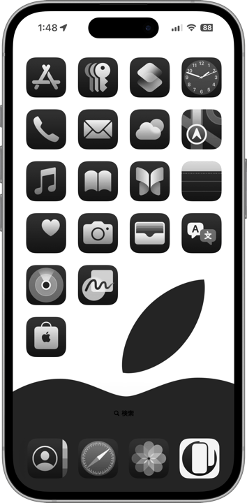
iOS 13 introduced Dark Mode, creating two separate thresholds for Dock-hiding wallpapers using the same principles.
In Light Mode, the Dock generally brightened the wallpaper but had an upper brightness limit. In Dark Mode, the opposite applied: darkness had a lower limit.
Except in cases where wallpapers became so saturated they triggered forced darkening, brightness evaluation itself no longer mattered. The trick instead became matching the exact upper and lower threshold colors.
The result was stable black and white Dock-hiding wallpapers released simultaneously. Not perfectly black or perfectly white — but stable enough to disappear reliably.
➜ Magic Pastel 3
However, under Dark Mode, colored Docks became so dark they were difficult to distinguish anyway.
However, under Dark Mode, colored Docks became so dark they were difficult to distinguish anyway.
iOS 16.0–18.7
September 2022 – September 2025
iOS 16 removed the Parallax Effect. The Dock-hiding colors themselves remained unchanged, but I had to redesign the layout of almost every wallpaper across the entire site.
“Hide Dock Seasons,” previously treated as a separate category until iOS 15, were merged into the main Dock-hiding category.
“Hide Dock Seasons,” previously treated as a separate category until iOS 15, were merged into the main Dock-hiding category.
➜ Hide Dock Seasons
“Custom Dock Wallpapers,” treated separately until iOS 18, also relied on the exact same Dock-hiding tricks despite their different presentation style.
“Custom Dock Wallpapers,” treated separately until iOS 18, also relied on the exact same Dock-hiding tricks despite their different presentation style.

➜ Custom Dock Wallpapers
Since those categories depended heavily on their artwork itself, they did not use the small-size tricks from iOS 8.3–10.3.
Since those categories depended heavily on their artwork itself, they did not use the small-size tricks from iOS 8.3–10.3.
iOS 26.0–
September 2025 –
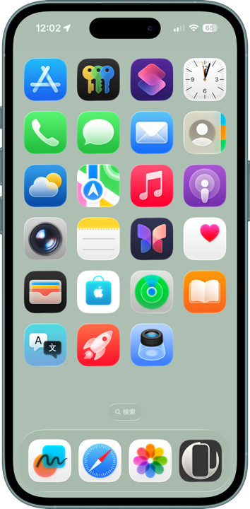
With the introduction of the Liquid Glass design, completely hiding the Dock became impossible. Glass-like reflective effects now appear around its edges.
However, matching the upper and lower threshold colors of each mode remains possible.
On iPhones before the iPhone 14 series, the non-reflective portions blend into the background. On iPhone 14 and later, the Dock border appears and disappears dynamically as the glass reflections move with device tilt.
The upper brightness limit became much darker, while the lower darkness limit became much brighter, creating surprisingly pleasant tones that are neither too pale nor too dark.
On OLED iPhones, the Dock color differs between real devices and screenshots, so the colors were matched by eye on actual hardware.
➜ Dark Ninja Dock
Under settings where “Reduce Transparency” darkens the Dock, the lower darkness limit became even darker than Dark Mode from iOS 13 through 18.
Unlike the standard versions, these show no screenshot discrepancies or screen-type variation, and even work on iPad.
Under settings where “Reduce Transparency” darkens the Dock, the lower darkness limit became even darker than Dark Mode from iOS 13 through 18.
Unlike the standard versions, these show no screenshot discrepancies or screen-type variation, and even work on iPad.
➜ Black Ninja Dock
On the other hand, when “Reduce Transparency” brightens the Dock, even pure white wallpapers only produce a Dock color nearly identical to the gray used in Light Ninja Dock.
Unfortunately, I have still not managed to create a true white version there.
On the other hand, when “Reduce Transparency” brightens the Dock, even pure white wallpapers only produce a Dock color nearly identical to the gray used in Light Ninja Dock.
Unfortunately, I have still not managed to create a true white version there.