カラーUIの物語
The Color UI Story
画面サイズが増えたから。
Because screen sizes kept multiplying.
Because screen sizes kept multiplying.
➜ English
過去、ドックやフォルダをカラーにする方法は大きく4つありました。特に強力なトリックは2つ、小さなサイズで周辺部の色を拾うトリックと、透明度を下げる設定で全体から色を拾うトリックです。
★
- 一部マイクロサイズの壁紙には最新iOSで長押し保存できないものがあります。
- 代表的なトリックにスクショとリンクを添えて歴史をまとめています。
- 細かい閾値の変更は省略しています。実際にはもっと多くのバージョンがありました。
- トリックによって仕様が変更されたiOSのバージョンが異なるため、後に作られたトリックが先に使えなくなることもあります。
- 原則としてメジャーアップデート後の旧バージョンのマイナーアップデートは追跡していません。
- 対応OSのリリース期間を目安として表記しています。壁紙の公開とは必ずしも一致しません。
- このページは2026年5月にまとめました。
iOS 8.0–10.3
2014年9月 – 2017年9月
気付いたのはiPhone 6/6 Plusが発売されたから。
視差効果の余白の帯で明るさを操作してドックを隠す壁紙は、iOS 8で7よりもドックとフォルダの滲みが強くなりました。
iPhone 5よりも画面サイズが大きな6に、5用のドックを隠す壁紙を使ってみると滲みがますます強まったのです。
視差効果の余白の帯で明るさを操作してドックを隠す壁紙は、iOS 8で7よりもドックとフォルダの滲みが強くなりました。
iPhone 5よりも画面サイズが大きな6に、5用のドックを隠す壁紙を使ってみると滲みがますます強まったのです。
なら壁紙の方をもっと小さくすれば色を付けられるはず。
iOS 8では壁紙が規定のサイズよりも小さければ小さいほど、ドックやフォルダが壁紙周辺部の色を拾います。
そこで視差効果のための余白に、iPhoneを傾けても見えない細さの帯をぎりぎり作れる小さなサイズの壁紙を作成。
ドックとフォルダを本当にカラーにできました。
iOS 8では壁紙が規定のサイズよりも小さければ小さいほど、ドックやフォルダが壁紙周辺部の色を拾います。
そこで視差効果のための余白に、iPhoneを傾けても見えない細さの帯をぎりぎり作れる小さなサイズの壁紙を作成。
ドックとフォルダを本当にカラーにできました。


➜ 不思議の壁紙
必要以上に細長いのはこのサイズだと相対的に下の方しか表示されず上の方に捨てるスペースが必要だったから。関係ない所にまで色が入っているのは当時のカメラロールでの閲覧性のためです。
なおiOS 9.3–10.3では小さな壁紙でところどころフォルダが丸くなるバグも楽しめました。
必要以上に細長いのはこのサイズだと相対的に下の方しか表示されず上の方に捨てるスペースが必要だったから。関係ない所にまで色が入っているのは当時のカメラロールでの閲覧性のためです。
なおiOS 9.3–10.3では小さな壁紙でところどころフォルダが丸くなるバグも楽しめました。
iOS 7.0–15.7
2015年8月(2013年9月)– 2022年9月
対応OSの順番は前後しますが、制作したのはiOS 8.4の時。通常サイズでもカラーUIが作れないかという試みでした。
派手な補色同士を格子状に敷き詰めて目眩しに。補色なのでドックとフォルダへの影響は相殺されます。
背景の広い部分には目立たないように暗くて濃い、その2色から離れた色を使い、ドックとフォルダにはその色だけが明るくされて出てくるという仕組みでした。
派手な補色同士を格子状に敷き詰めて目眩しに。補色なのでドックとフォルダへの影響は相殺されます。
背景の広い部分には目立たないように暗くて濃い、その2色から離れた色を使い、ドックとフォルダにはその色だけが明るくされて出てくるという仕組みでした。

➜ 着色の壁紙
冒頭に挙げた強力じゃない方のトリックのひとつ。いまいちな上に目がちらちらするのでひっそりと型落ち扱いにしました。
iOS 26だとリキッドグラスの高い透過性でいよいよキモいことになります。
冒頭に挙げた強力じゃない方のトリックのひとつ。いまいちな上に目がちらちらするのでひっそりと型落ち扱いにしました。
iOS 26だとリキッドグラスの高い透過性でいよいよキモいことになります。
iOS 10.0–10.1
2016年9月 – 2016年12月
壁紙が必ず暗くされるようになったものの、高さが1ピクセルの壁紙を設定するとドックとフォルダは壁紙の平均色をダイレクトに出すようになりました。
横の余白を思い切り広く取って100枚ものバリエーションが可能に。
横の余白を思い切り広く取って100枚ものバリエーションが可能に。


iOS 10.2–10.3
2016年12月 – 2017年9月
1ピクセルサイズのトリックは効かなくなり、2ピクセル3ピクセルで延命するも不安定で設定条件はややこしいものでした。
iOS 8以来のトリックなら、サイズや配色を変えて安定して使えています。
iOS 8以来のトリックなら、サイズや配色を変えて安定して使えています。

iOS 11.0–15.7
2017年9月 – 2022年9月
iOS 11では小さな壁紙の謎仕様がすべて廃止されました。大きくても小さくてもただの画像です。ドックやフォルダをカラーにすることもありません。
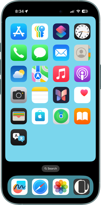
そこで最も直接的な方法でドックをカラーにします。背後に色を置く、冒頭のもう一つの弱い方のトリックです。
そこで最も直接的な方法でドックをカラーにします。背後に色を置く、冒頭のもう一つの弱い方のトリックです。


iOS 12.0–15.7
2018年9月 – 2022年9月
iOS 12で「透明度を下げる」に大きな変更がありました。それまで常に一定のグレーだったものが背景色を拾うようになったのです。
正方形のときに余白の着色力が最大化することをつきとめ、表示範囲外で平均値を操作しました。ドックとフォルダで色を拾いやすいエリアが違い、別の色にすることもできました。
正方形のときに余白の着色力が最大化することをつきとめ、表示範囲外で平均値を操作しました。ドックとフォルダで色を拾いやすいエリアが違い、別の色にすることもできました。

iOS 13.0–15.7
2019年9月 – 2022年9月
ダークモードの導入に伴い、ドックとフォルダをダークモードで更に暗くする壁紙を制作。黒い網点を敷き詰めて見た目よりも黒が多くなるようにしました。
ダークモードよりダークモードな壁紙です。
ダークモードよりダークモードな壁紙です。

iOS 16.0–18.7
2022年9月 – 2025年9月
視差効果が廃止され余白もなくなりました。しかし透明度を下げたときにドックとフォルダが背景全体を反映する仕様は残っています。
ドックの背後だけを平均から外れた色にして目立たせました。
ドックの背後だけを平均から外れた色にして目立たせました。
iOS 26.0
2025年9月 – 2025年11月
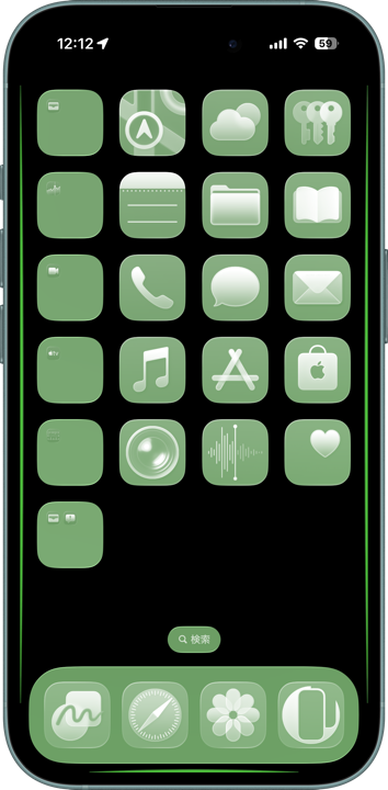
透明度を下げたときに、ドックとフォルダが画面の端の色を非常に強く拾う仕様に。
黒い背景で端の所に強い色を配置して、再び鮮やかなドックとフォルダを実現。
黒い背景で端の所に強い色を配置して、再び鮮やかなドックとフォルダを実現。
➜ スーパーカラー壁紙
しかしiOS 26.1で色を拾う範囲が変更、それまでの均一色ではなくすぐ近くの色を拾うように。透明度を下げる設定の透明度が上がってしまいました。
ここで一旦カラーUIの壁紙はレガシーカテゴリーとします。過去にも余白廃止で一度レガシー化して復活させた経緯はあるのですが……
しかしiOS 26.1で色を拾う範囲が変更、それまでの均一色ではなくすぐ近くの色を拾うように。透明度を下げる設定の透明度が上がってしまいました。
ここで一旦カラーUIの壁紙はレガシーカテゴリーとします。過去にも余白廃止で一度レガシー化して復活させた経緯はあるのですが……
In the past, there were four major ways to color the Dock and folders. Two of them were especially powerful: one trick used small wallpapers to make the system sample colors from the edges, while another used the “Reduce Transparency” setting to sample colors from the entire wallpaper.
★
- Some micro-sized wallpapers can no longer be saved by long-pressing on the latest iOS versions.
- This is a historical overview of the major tricks, accompanied by screenshots and links.
- Minor threshold adjustments are omitted. In reality, there were even more variations.
- Because each trick depended on different iOS behaviors, some newer tricks stopped working before older ones.
- As a rule, I do not track minor updates for older iOS versions after a major update is released.
- Supported OS versions are listed based on their release periods and do not necessarily match the wallpaper release dates.
- This page was compiled in May 2026.
iOS 8.0–10.3
September 2014 – September 2017
I first noticed the behavior because the iPhone 6 and iPhone 6 Plus had been released.
Wallpapers that hid the Dock using brightness manipulation within the Parallax Effect margins became blurrier in iOS 8 compared to iOS 7. When I tried using Dock-hiding wallpapers designed for the iPhone 5 on the larger screen iPhone 6, the blurring became even stronger.
Wallpapers that hid the Dock using brightness manipulation within the Parallax Effect margins became blurrier in iOS 8 compared to iOS 7. When I tried using Dock-hiding wallpapers designed for the iPhone 5 on the larger screen iPhone 6, the blurring became even stronger.
So I thought: if making the screen larger strengthens the effect, shrinking the wallpaper further should allow actual colorization.
In iOS 8, the smaller the wallpaper was compared to the expected size, the more the Dock and folders sampled colors from the wallpaper’s outer edges.
I created extremely small wallpapers with barely visible colored strips placed in the parallax margins — thin enough that they would remain invisible even when tilting the phone.
That finally made it possible to create genuinely colored Dock and folders.
➜ Color
By shrinking the wallpapers even further and accepting some overflow, differences between Dock and folder colors began to appear. Folders gradually became more likely to sample colors closer to the center instead of the edges.
I succeeded in giving the Dock and folders different colors.
By shrinking the wallpapers even further and accepting some overflow, differences between Dock and folder colors began to appear. Folders gradually became more likely to sample colors closer to the center instead of the edges.
I succeeded in giving the Dock and folders different colors.
➜ Wonderland
The wallpapers were unnecessarily tall because, at those dimensions, only the lower portion ended up visible on screen, forcing me to waste space at the top. Colors extending into unrelated areas existed purely to improve visibility in the old Camera Roll interface.
Incidentally, in iOS 9.3–10.3 there was also a bug where tiny wallpapers sometimes caused folders to become rounded in some places.
iOS 7.0–15.7
August 2015 (September 2013) – September 2022
Although the supported OS order overlaps, I actually created this during the iOS 8.4 era. The goal was to see whether colored UI effects could be achieved using normal-sized wallpapers.
I arranged vivid complementary colors in a grid pattern to create a dazzling, eye-confusing effect. Because they were complementary colors, their influence on the Dock and folders canceled out.
In the large background areas, I used dark, saturated colors unrelated to those two complementary tones so they would remain subtle. But inside the Dock and folders, only those colors got brightened and surfaced inside the Dock and folders.
➜ Coloring
This was one of the weaker tricks mentioned earlier. The results were mediocre and visually tiring, so I quietly treated it as obsolete.
Under iOS 26, the high transparency of Liquid Glass makes it look especially unsettling.
This was one of the weaker tricks mentioned earlier. The results were mediocre and visually tiring, so I quietly treated it as obsolete.
Under iOS 26, the high transparency of Liquid Glass makes it look especially unsettling.
iOS 10.0–10.1
September 2016 – December 2016
Wallpapers began automatically darkening, but setting a wallpaper only 1 pixel tall caused the Dock and folders to display the wallpaper’s average color directly.
By making the horizontal margins extremely wide, I was able to create as many as 100 variations.
By making the horizontal margins extremely wide, I was able to create as many as 100 variations.
➜ Bicolor
If the wallpaper became even wider, another bug appeared where the Dock and folders turned completely black regardless of the wallpaper color.
If the wallpaper became even wider, another bug appeared where the Dock and folders turned completely black regardless of the wallpaper color.
iOS 10.2–10.3
December 2016 – September 2017
The 1-pixel trick stopped working. I managed to prolong it briefly using 2-pixel and 3-pixel variations, but the behavior became unstable and the setup conditions complicated.
Meanwhile, the older iOS 8-era trick remained stable simply by adjusting the size and color arrangement.
Meanwhile, the older iOS 8-era trick remained stable simply by adjusting the size and color arrangement.
iOS 11.0–15.7
September 2017 – September 2022
In iOS 11, all the mysterious behaviors related to tiny wallpapers were removed. Large or small, wallpapers became just ordinary images. They no longer colored the Dock or folders.
So I switched to the most direct possible approach: placing color behind the Dock itself. This was the other weaker trick mentioned at the beginning.
So I switched to the most direct possible approach: placing color behind the Dock itself. This was the other weaker trick mentioned at the beginning.
➜ Color Dock 2
Although I carefully aligned positions and refined ways to keep the Dock color visually uniform, the trick itself remained fundamentally limited. It also required separate versions for every device. Whenever display positions changed, I had to rebuild everything.
Although I carefully aligned positions and refined ways to keep the Dock color visually uniform, the trick itself remained fundamentally limited. It also required separate versions for every device. Whenever display positions changed, I had to rebuild everything.
iOS 12.0–15.7
September 2018 – September 2022
In iOS 12, the “Reduce Transparency” setting changed dramatically. Previously it always displayed a fixed gray, but now it began sampling colors from the wallpaper background.
I discovered that square images maximized the coloring strength of the margins, allowing me to manipulate the average color outside the visible area.
The Dock and folders sampled colors from slightly different regions, which even made separate colors possible.
I discovered that square images maximized the coloring strength of the margins, allowing me to manipulate the average color outside the visible area.
The Dock and folders sampled colors from slightly different regions, which even made separate colors possible.
iOS 13.0–15.7
September 2019 – September 2022
With the introduction of Dark Mode, I created wallpapers that made the Dock and folders appear even darker than Dark Mode itself.
By covering the wallpaper with dense black halftone dots, the actual amount of black became greater than the image visually appeared to contain.
Dark Mode beyond Dark Mode.
By covering the wallpaper with dense black halftone dots, the actual amount of black became greater than the image visually appeared to contain.
Dark Mode beyond Dark Mode.
➜ Super Dark Mode
The balance between dot scale and perceived color was extremely delicate, so I never updated the category for iOS 16.
The balance between dot scale and perceived color was extremely delicate, so I never updated the category for iOS 16.
iOS 16.0–18.7
September 2022 – September 2025
The Parallax Effect was removed, along with the concept of margins. However, under “Reduce Transparency,” the Dock and folders still reflected the overall wallpaper colors.
I made only the area behind the Dock differ strongly from the overall average so it would stand out.
I made only the area behind the Dock differ strongly from the overall average so it would stand out.
iOS 26.0
September 2025 – November 2025
Under “Reduce Transparency,” the Dock and folders suddenly began sampling colors from the screen edges extremely strongly.
Using black backgrounds with vivid colors placed only at the edges, I managed to create bright colorful Docks and folders once again.
Using black backgrounds with vivid colors placed only at the edges, I managed to create bright colorful Docks and folders once again.
➜ Super Color
However, in iOS 26.1 the color sampling range changed again. Instead of using a uniform average color, the system began sampling nearby colors directly. The transparency level of “Reduce Transparency” itself increased.
At this point, I decided to treat Color UI Wallpapers as a legacy category.
Though to be fair, this is not the first time the category has become “legacy.” It already disappeared once when the margin system itself was removed — and later returned again…