色をつける壁紙
Add Color
iOS 16–18
16 Pro Max/16 Pro/16 Plus/16/16e/
15 Pro Max/15 Pro/15 Plus/15/
14 Pro Max/14 Pro/14 Plus/14/
13 Pro Max/13 Pro/13/13 mini/
12 Pro Max/12 Pro/12/12 mini/
11 Pro Max/11 Pro/11/XS Max/XS/XR/X/
SE3/SE2/8 Plus/8
16 Pro Max/16 Pro/16 Plus/16/16e/
15 Pro Max/15 Pro/15 Plus/15/
14 Pro Max/14 Pro/14 Plus/14/
13 Pro Max/13 Pro/13/13 mini/
12 Pro Max/12 Pro/12/12 mini/
11 Pro Max/11 Pro/11/XS Max/XS/XR/X/
SE3/SE2/8 Plus/8
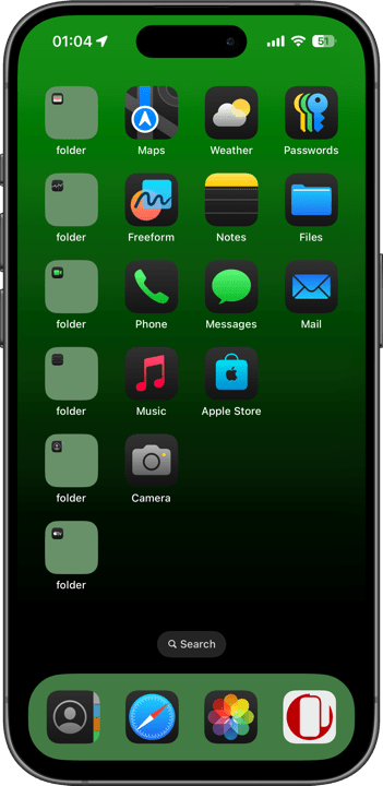
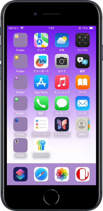
ドックなどを本当にカラーにする壁紙。
シンプルグラデバージョン。
Wallpapers truly color the Dock and more.
Simple gradation version.
シンプルグラデバージョン。
Wallpapers truly color the Dock and more.
Simple gradation version.
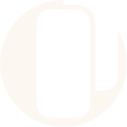
9×16
Universal Wallpaper
Universal Wallpaper
How to Set
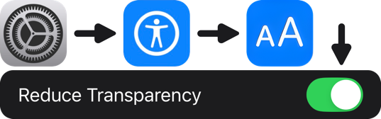
設定➜アクセシビリティ⬇︎
画面表示とテキストサイズ⬇︎
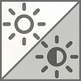
透明度を下げるオン
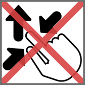
ピンチインして上に・ぼかしオフ
「自然光」
ホーム画面の明暗はお好みで
───────────────
Settings ➜ Accessibility ⬇︎
Display & Text Size ⬇︎
Turn on Reduce Transparency.
Pinch in then swipe up and Blur off.
Natural
Home Screen brightness is up to you.
・
Help
画面表示とテキストサイズ⬇︎
透明度を下げるオン
ピンチインして上に・ぼかしオフ
「自然光」
ホーム画面の明暗はお好みで
───────────────
Settings ➜ Accessibility ⬇︎
Display & Text Size ⬇︎
Turn on Reduce Transparency.
Pinch in then swipe up and Blur off.
Natural
Home Screen brightness is up to you.
・
Help
画像を長押し保存してください。
───────────────
Tap and hold to save the image.
▼
───────────────
Tap and hold to save the image.
▼


⚠️
⚠️
- ホーム画面のカスタマイズで壁紙を暗くしてもドックは暗くなりません。
- iOS 18以降ではコントロールセンターに透明度を下げるボタンを置くこともできます。
- ピンチ操作は利きません。設定中に壁紙を動かすと上部が白くまたは黒くぼかされます。元に戻すには一度他の壁紙を設定した後で再度設定し直してください。同じ壁紙のままではもう一度やっても変更なしの扱いになります。
- ホーム画面のぼかしをオンにすると背景が均一になってしまいドックの色が目立ちません。
- スタイルで背景の色を変えたときもドックの背景に色がついてしまいます。
- ロック画面に設定した場合、機種と色の組み合わせによっては時計がほとんど見えなくなります。時計の下にウィジェットを追加するとこれを回避できます。
- 黒ベースの壁紙はホーム画面のカスタマイズで壁紙を暗くした方がドックとフォルダの色は目立ちます。壁紙を暗くしてもドックやフォルダの色は変わりません。白ベースは明るい方が目立ちます。
- このページでは9×16ピクセルの壁紙を、保存しやすいように160×280ピクセル相当に引き伸ばして表示しています。
⚠️
- Darkening the wallpaper in Home Screen customization won’t darken the Dock.
- In iOS 18 and later, you can also add a Reduce Transparency button to the Control Center.
- Pinch does not work. If you move the wallpaper while setting it, the top part is blurred in white or black. To restore the original color, set another wallpaper and then set it again. If you keep the same wallpaper, it will be treated as unchanged even if you try again.
- When the Home Screen Blur is enabled, the background becomes uniform, making the Dock’s color less noticeable.
- When you change the background color using Style, the Dock’s background will also get colored.
- When set on the Lock Screen, certain device and color combinations may make the clock almost invisible. You can avoid this by adding a widget below the clock.
- For black-based wallpapers, darkening the background in Home Screen customization makes the Dock and folder colors stand out more. Even if you darken the wallpaper, the colors of the Dock and folders won’t change. For white-based wallpapers, a brighter background works best.
- The 9 x 16 pixel wallpapers on this page are stretched to the equivalent of 160 x 280 pixels to make them easier to save.
色がつく仕組み
設定でアクセシビリティの透明度を下げるをオンにすると、ホーム画面とロック画面の半透過UIエレメントは不透明になって背景全体を反映した均一な色になります。アベレージで彩度が高ければ、彩度の低い場所にある着色されたエレメントは目立つという仕組みです。色の濃さはパーツによって若干異なり、ロック画面のボタンには色がつきません。
グラデーションとサイズ
コントラストの高いグラデーションは縞模様が現れがちですが、この壁紙は幅9ピクセル高さ16ピクセルという極小サイズでそれを回避しています。あまりに画像が小さいと、iOSがグラデーションを通常の画像では不可能なレベルで綺麗にぼかしてくれるのです。縞模様を目立たなくするためにノイズを重ねるなどの対策も要りません。
写真アプリでこの壁紙を表示すると綺麗なグラデーションになります(サムネイルでは逆に縞模様がくっきり出ます)。それをスクショした画像も綺麗です。しかしスクショを壁紙にすると縞模様が出やすくなります。小さなサイズのままがベストです。
またiPhoneでは通常サイズ壁紙の表示位置はまちまちですが、極小画像だと拡大縮小はできない代わりにアスペクトさえ合っていれば常に全画面表示になるようです。
小さな画像とドックがカラーになることに関係はありませんが、グラデーションと全機種対応が容易なのでこのサイズとしました。
How Colors Work
When you turn on Reduce Transparency in the Settings under Accessibility, semi-transparent UI elements on the Home and Lock screens become opaque, reflecting a uniform color based on the entire background. If the background has a high average saturation, UI elements placed in lower-saturation areas will stand out. The color intensity varies slightly between elements, and the Lock Screen buttons are not affected by color.
Gradient and Size
High-contrast gradients often produce banding, but this wallpaper avoids it with a tiny size of 9 pixels wide by 16 pixels high. If the image is too small, iOS blurs the gradient nicely at a level not possible with normal images. No measures such as layering noise to make the stripes less noticeable are also not necessary.
If you view this wallpaper in Photos, you will see a beautiful gradation (the stripes are clearly visible in the thumbnail). The screenshot is also beautiful. However, if you use it as a wallpaper, the stripes are more likely to appear. It is best to keep the small size.
In addition, the display position of normal size wallpaper is not always the same on the iPhone, but with a very small image, it can always be displayed in full screen as long as the aspect is correct, instead of being able to zoom in and out.
The small image size isn’t related to making the Dock colorful, but it allows for easier gradient creation and compatibility with all models, which is why I chose this size.