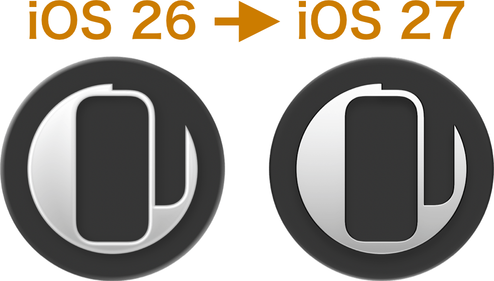
SNSアイコンやホーム画面に追加するアイコン(主要カテゴリーページのみ)をiOS 27テイストにしました。iOS 26よりもフラット寄りですっきりしています。
※Appleの公式ツール使用
ぼやけて見えるのを解消する狙いですね。サードパーティアプリはアプリ側の対応が必要でOSに合わせて変わるようです。
※Appleの公式ツール使用
ぼやけて見えるのを解消する狙いですね。サードパーティアプリはアプリ側の対応が必要でOSに合わせて変わるようです。
I’ve redesigned the SNS icons and the icons for adding to your Home Screen (on the main category pages only) to match the iOS 27 look — flatter and cleaner than iOS 26.
*Made using Apple’s official tool
The goal is to fix that blurry appearance. Third-party apps need to be updated by their developers to follow suit, since it looks like OS-matching is handled on the app’s end.
*Made using Apple’s official tool
The goal is to fix that blurry appearance. Third-party apps need to be updated by their developers to follow suit, since it looks like OS-matching is handled on the app’s end.